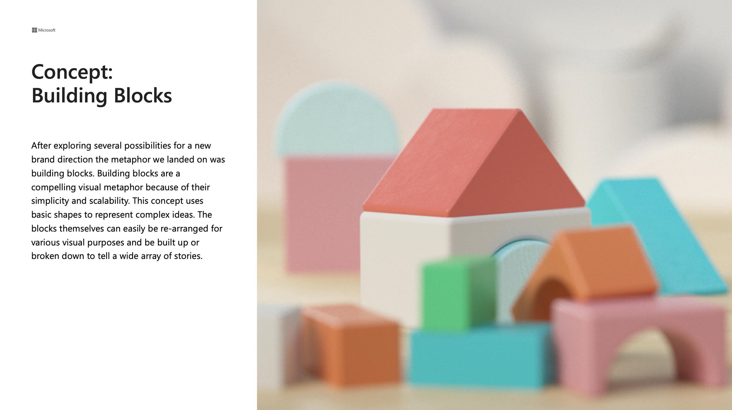
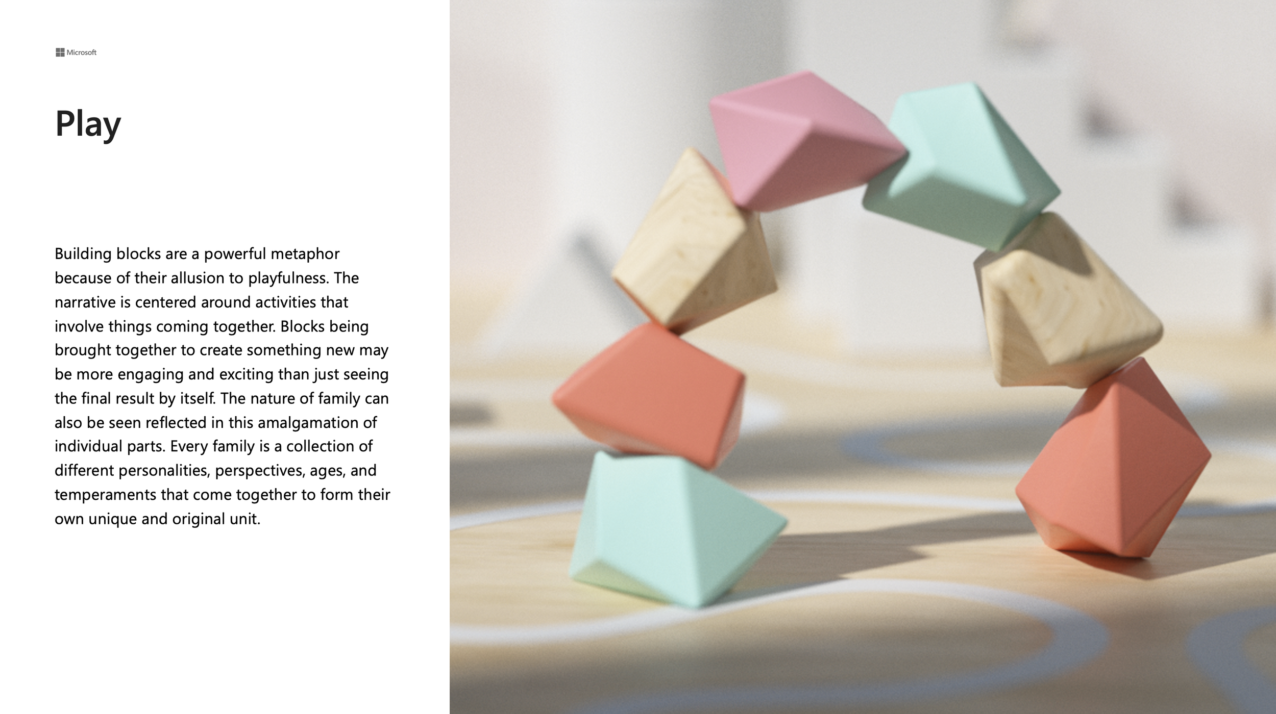
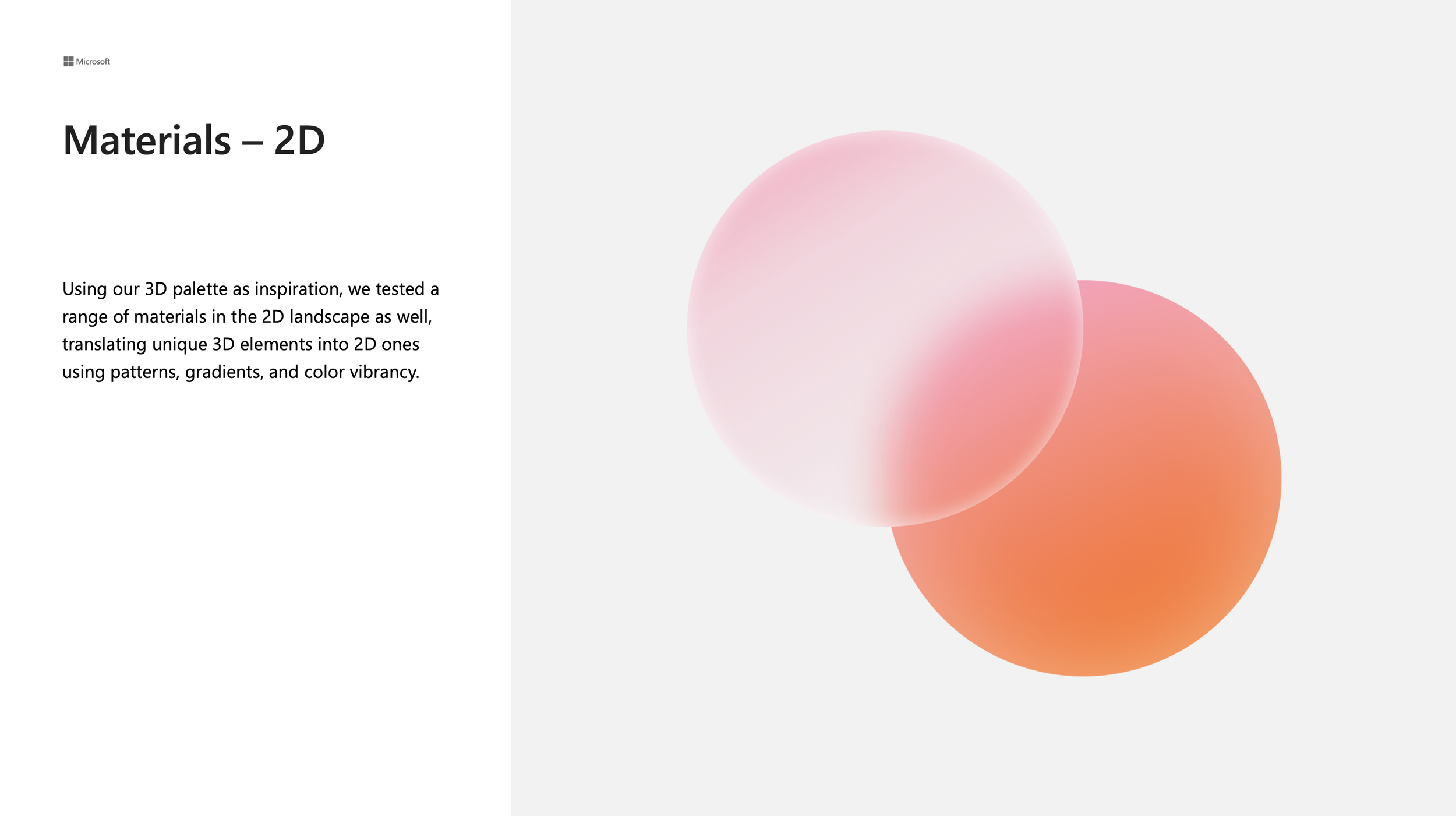
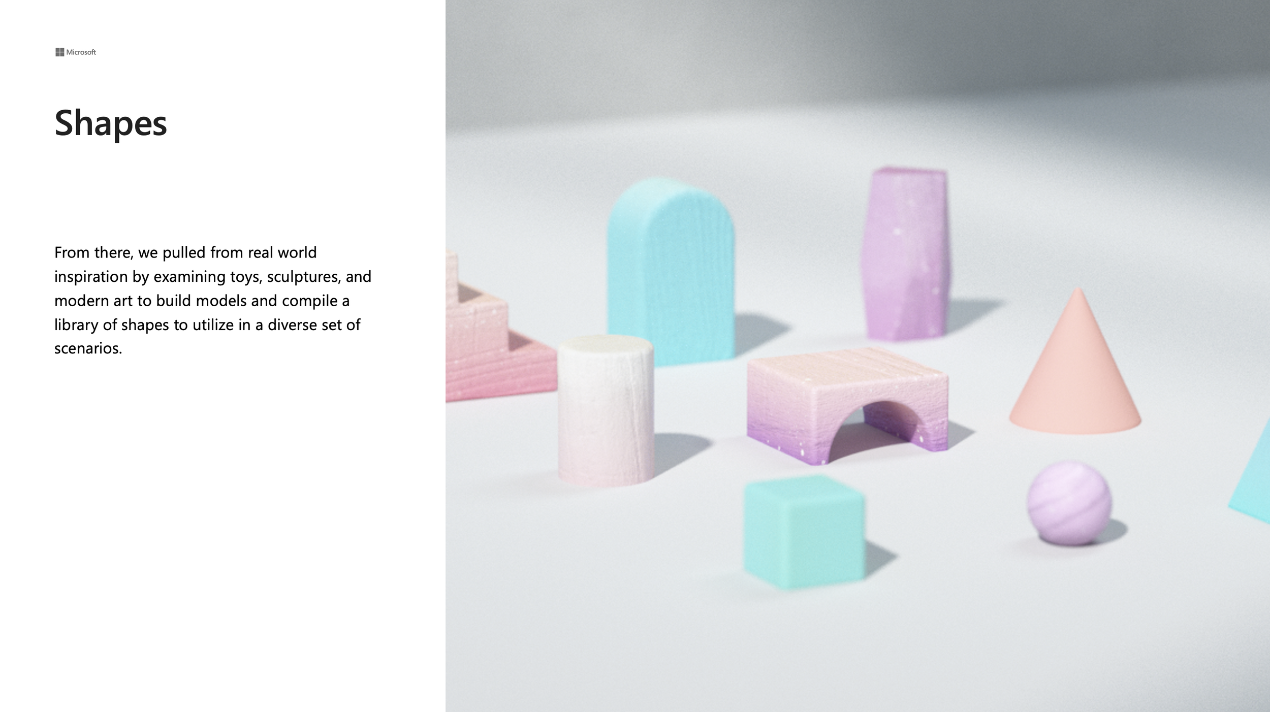
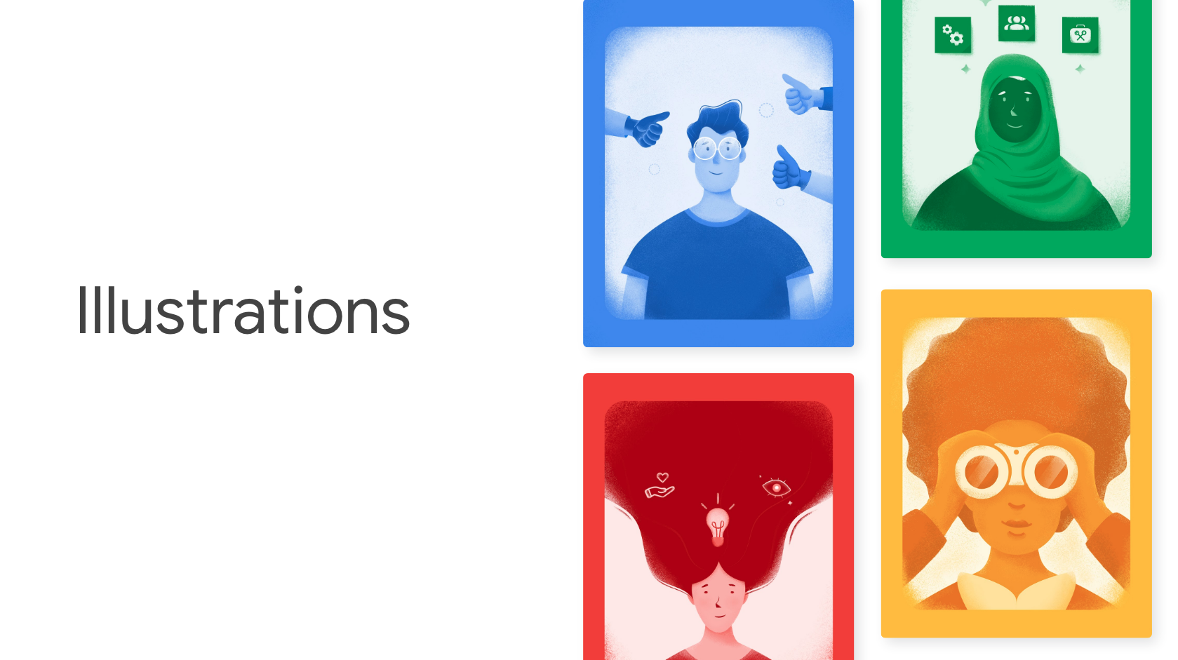
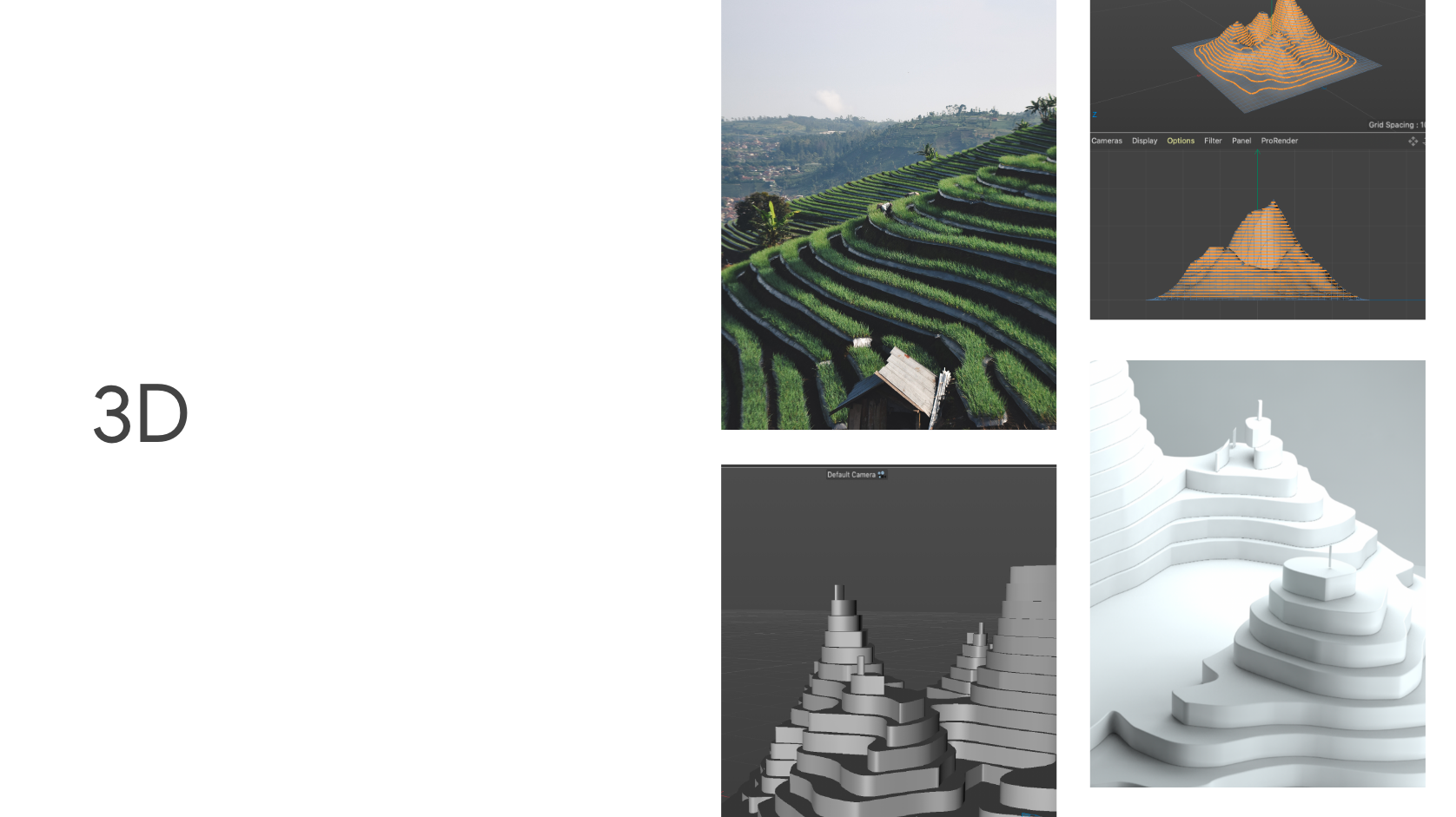
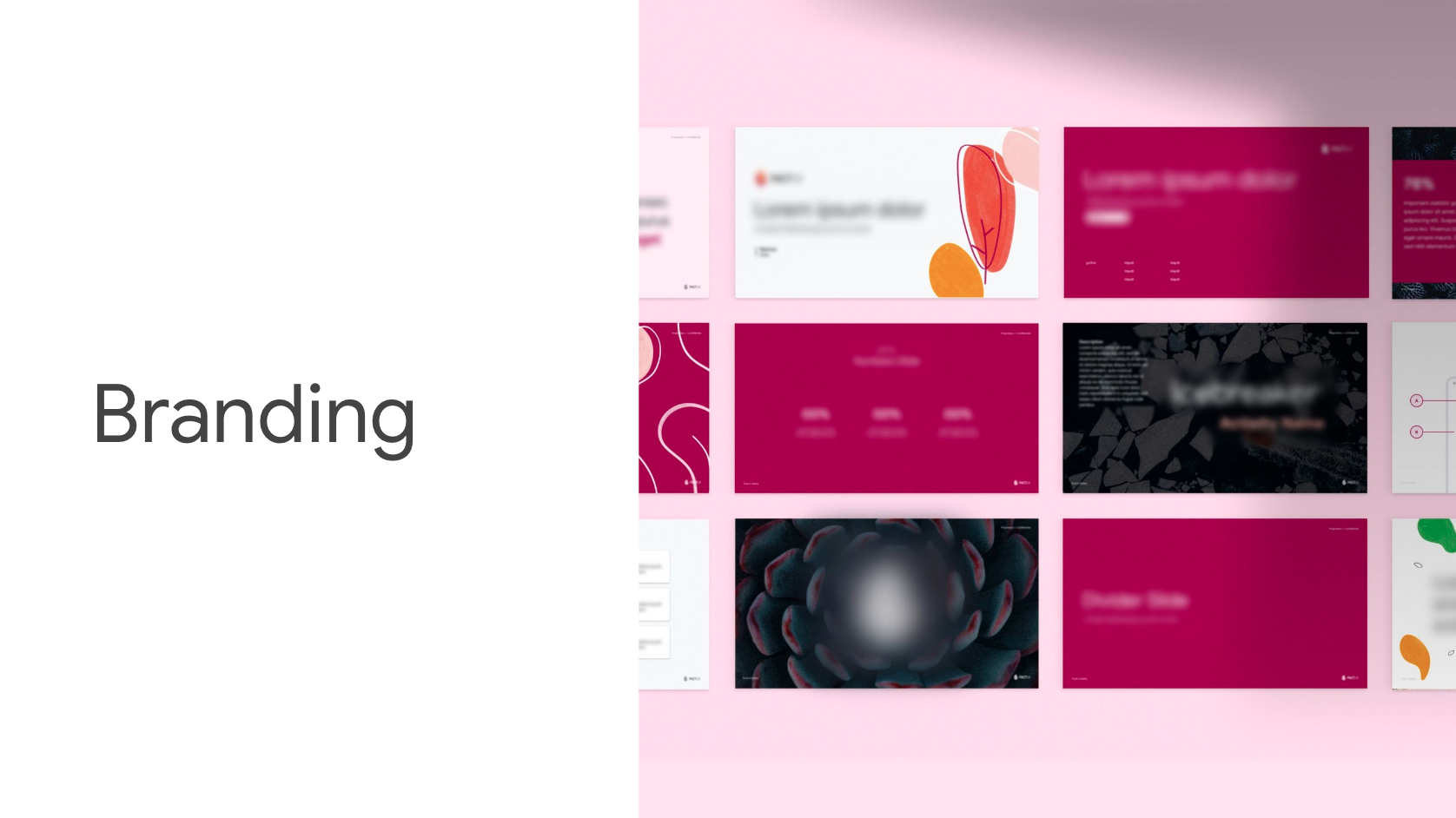
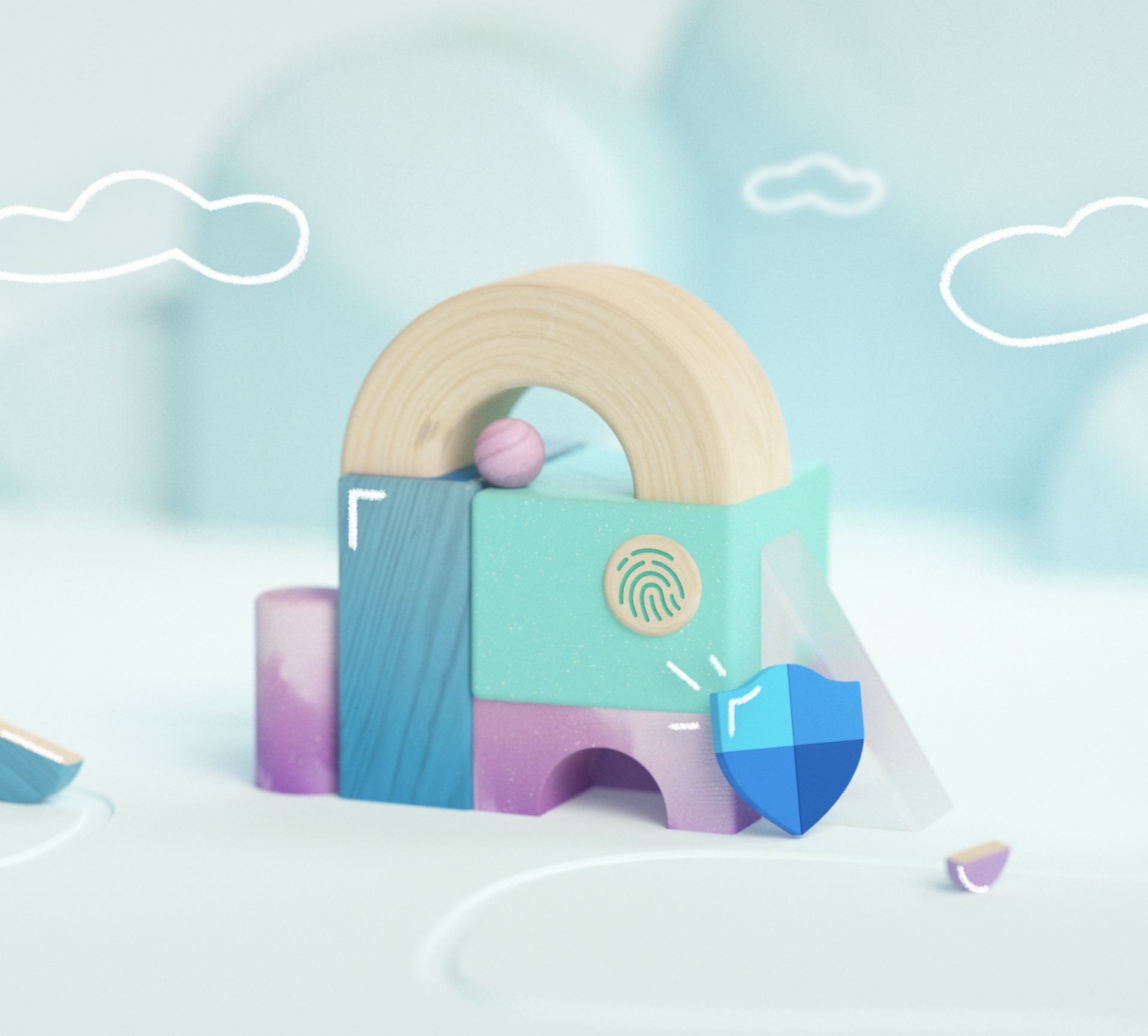
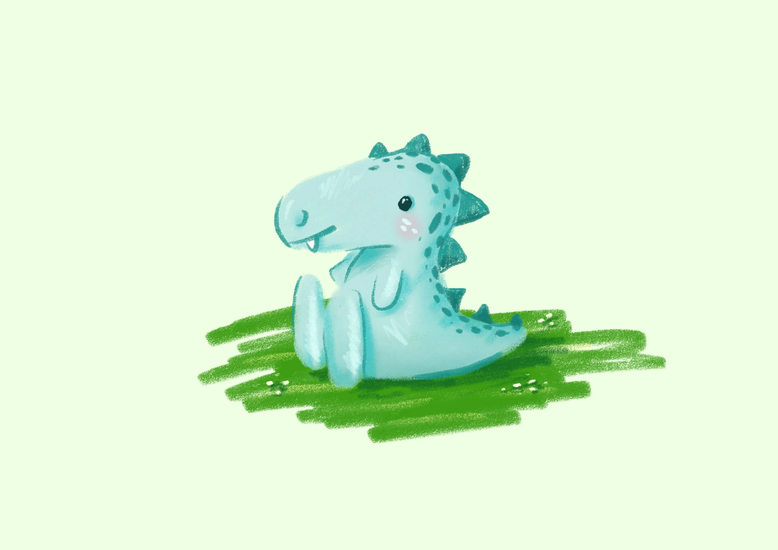
As the Visual Designer and Illustrator on the Microsoft Family team, I envisioned, created, and designed new brand direction, design system, and storytelling for Microsoft Family, which communicated a mixture of sophistication and playfulness to engage both our children and adult users. I also crafted a broad array of engaging in-product illustrations in a variety of styles (2D/3D) that fit the context and user flows. I was also responsible for reviewing team designs, giving detailed feedback, and providing guidance to ensure the product design conveyed on-brand consistency, strong aesthetics, and clear functionality.
Roles
Visual Designer & Artist: Taya Arnone
Motion Designer & Artist: Ryan Gagnier
Principal Design Manager: Karen Mui Scott
Communications Designer
*Unfortunately I am unable to feature the majority of my work here due to Google’s privacy policy. Some information has been blurred.
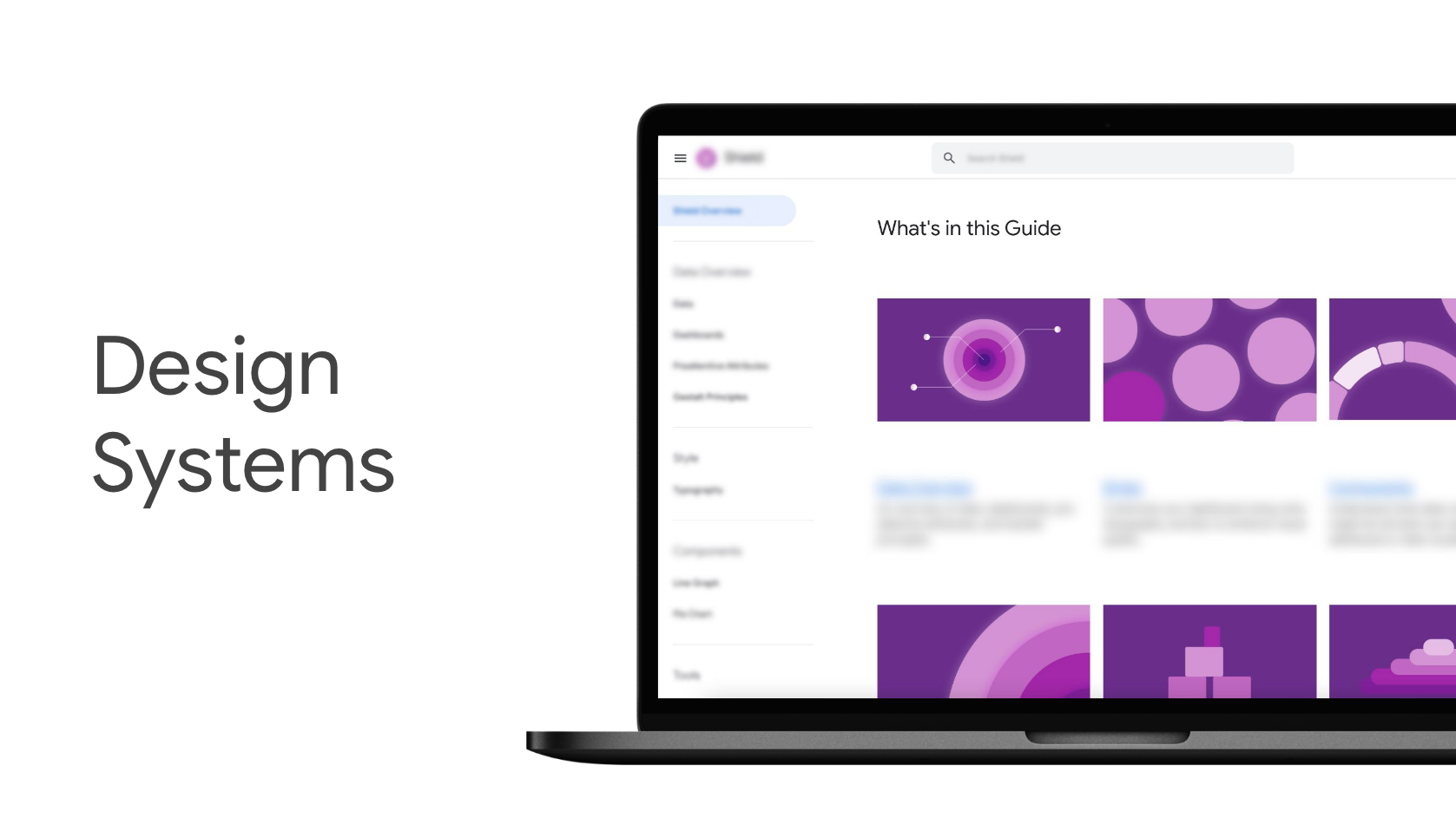
As a member of the Google Maps team, I was responsible for synthesizing a variety of highly technical content such as development program updates, user research findings, consumer segmentation insights, and data analytics. Accountable for crafting and weaving content into compelling, engaging, and memorable messaging aimed at audiences ranging from global UX team members to Google executives. Design projects often took the form of presentations, illustrations, infographics, videos, printed materials, emails, websites, templates, branding, in addition to contributing illustrations to the Google Maps platform user interface. Accompanying these projects, I was also in charge of holding workshops, generating presentation design guidelines, and giving design ethos presentations to Google Maps team members worldwide.
Visual Designer
*Unfortunately I am unable to feature the majority of my work here due to Google’s privacy policy. Some information has been blurred.
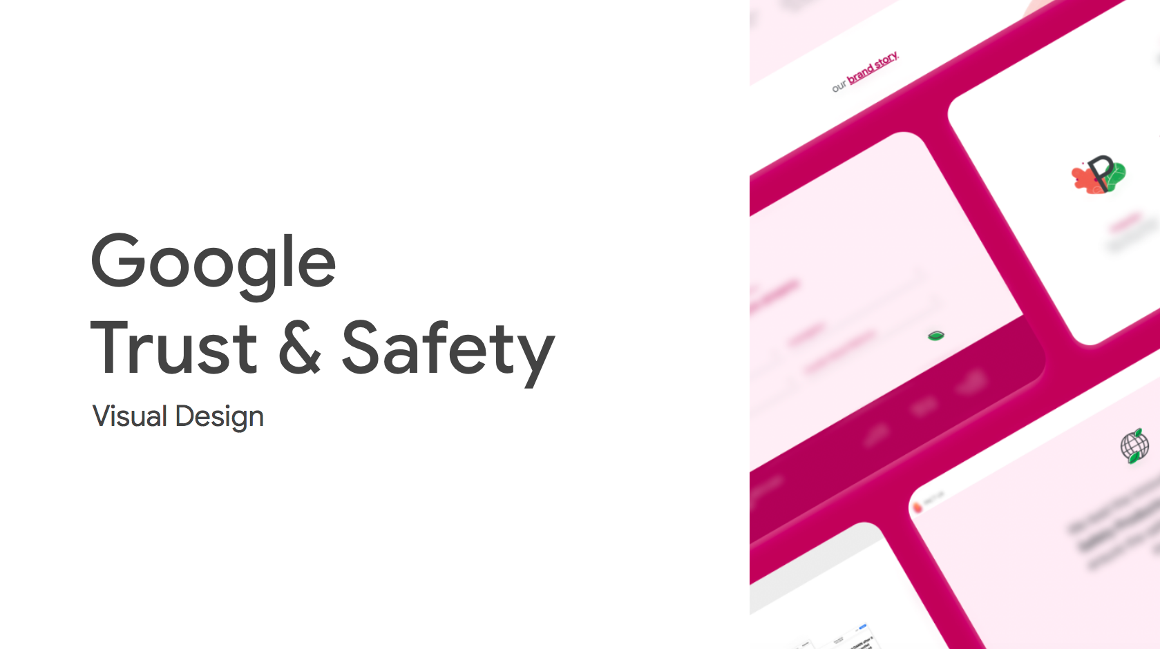
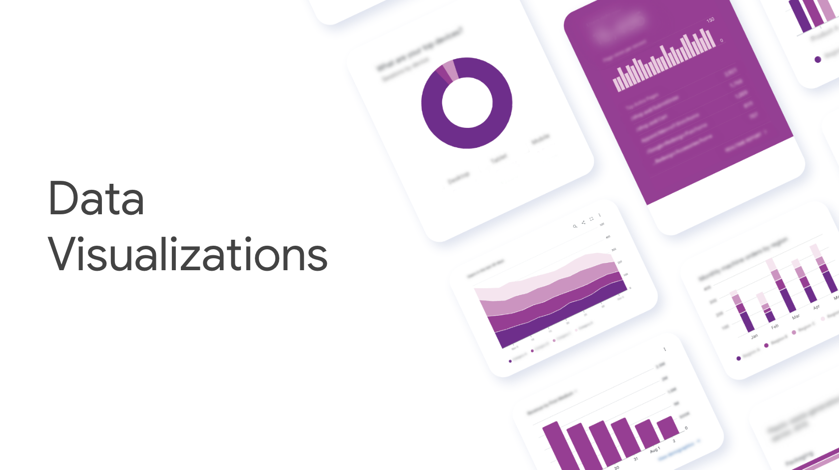
As a Visual Designer on the Trust & Safety team at Google, my role included weaving iconography, typography, color, space, and texture to help users navigate Google products. I was responsible for creating user interfaces, dashboards, and branding along with helping the Trust and Safety team researchers tell their stories with the intention of making the internet a safer, more beautiful place, free of violence, hate, abuse, and harm. I utilized key user-centered design principles to produce high quality visuals—from concept to execution and across different platforms. I collaborated with other designers to refine design language and create innovative products inspired with design ethos that people love to use.
L O W P O L Y S C E N E
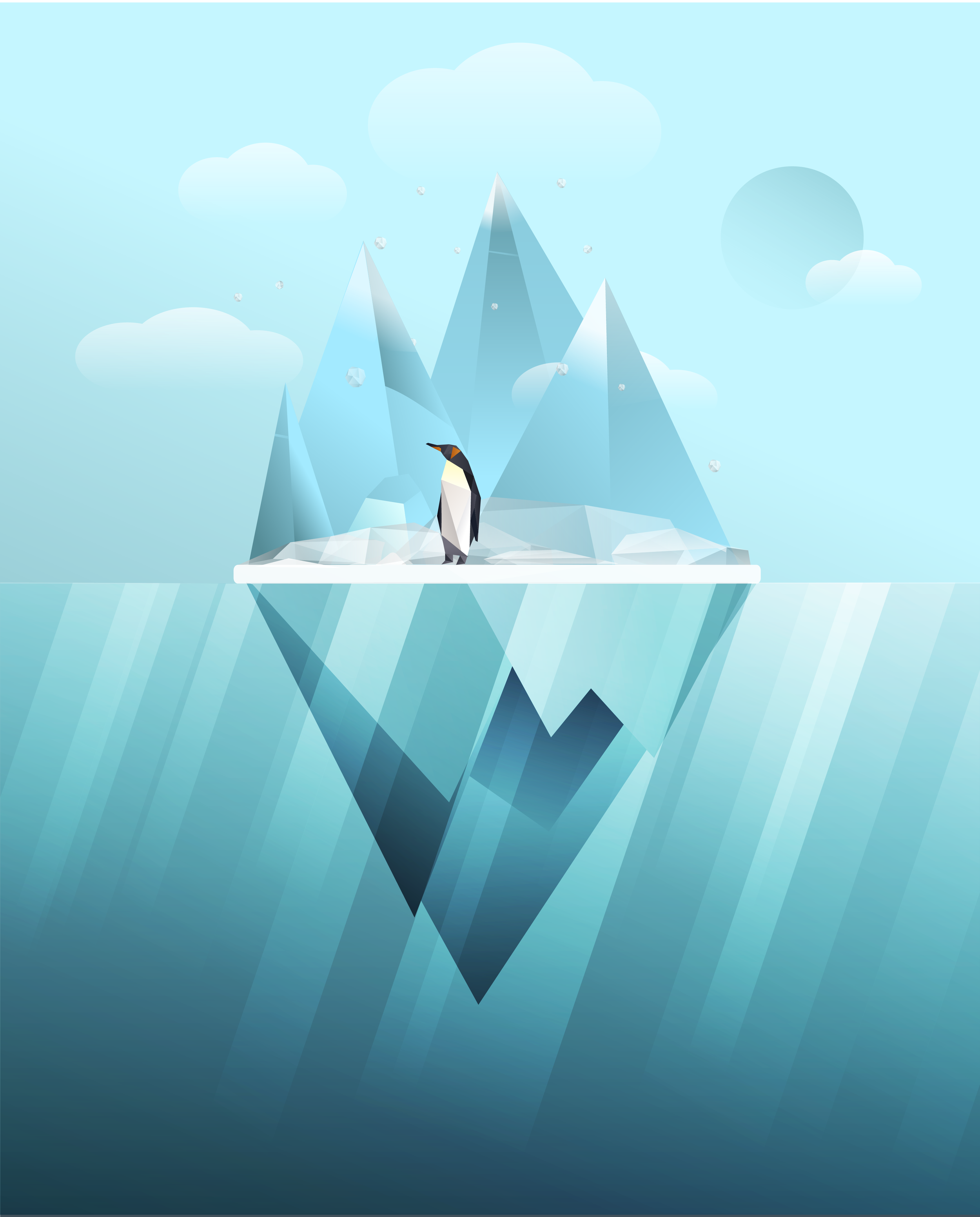
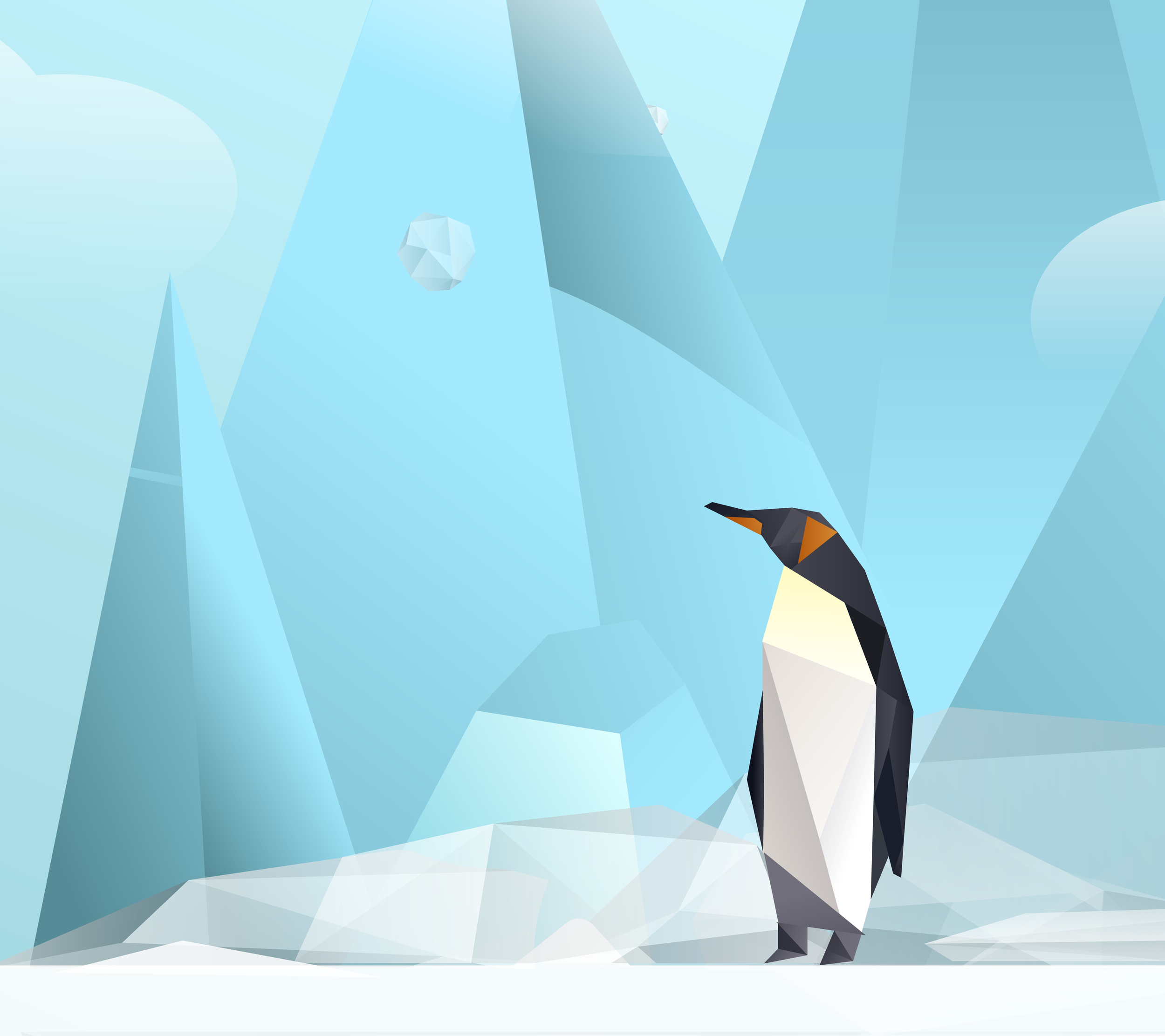
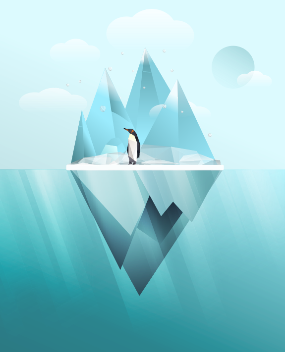
While experimenting my way through Adobe Illustrator I was inspired to create wildlife posters with animals in their natural habitats. Interested in exploring different styles, this poster started out being made entirely with polygon shapes, emulating the low poly design trend. The trend is based on meshes rendered with smaller amounts of polygons found in 3D computer graphics. Although I started out in 3D I found flat design to be more interesting along with a variety of shapes and overlaying opacities.
S K I L L S
Adobe Illustrator
W O R K S P A C E S E T
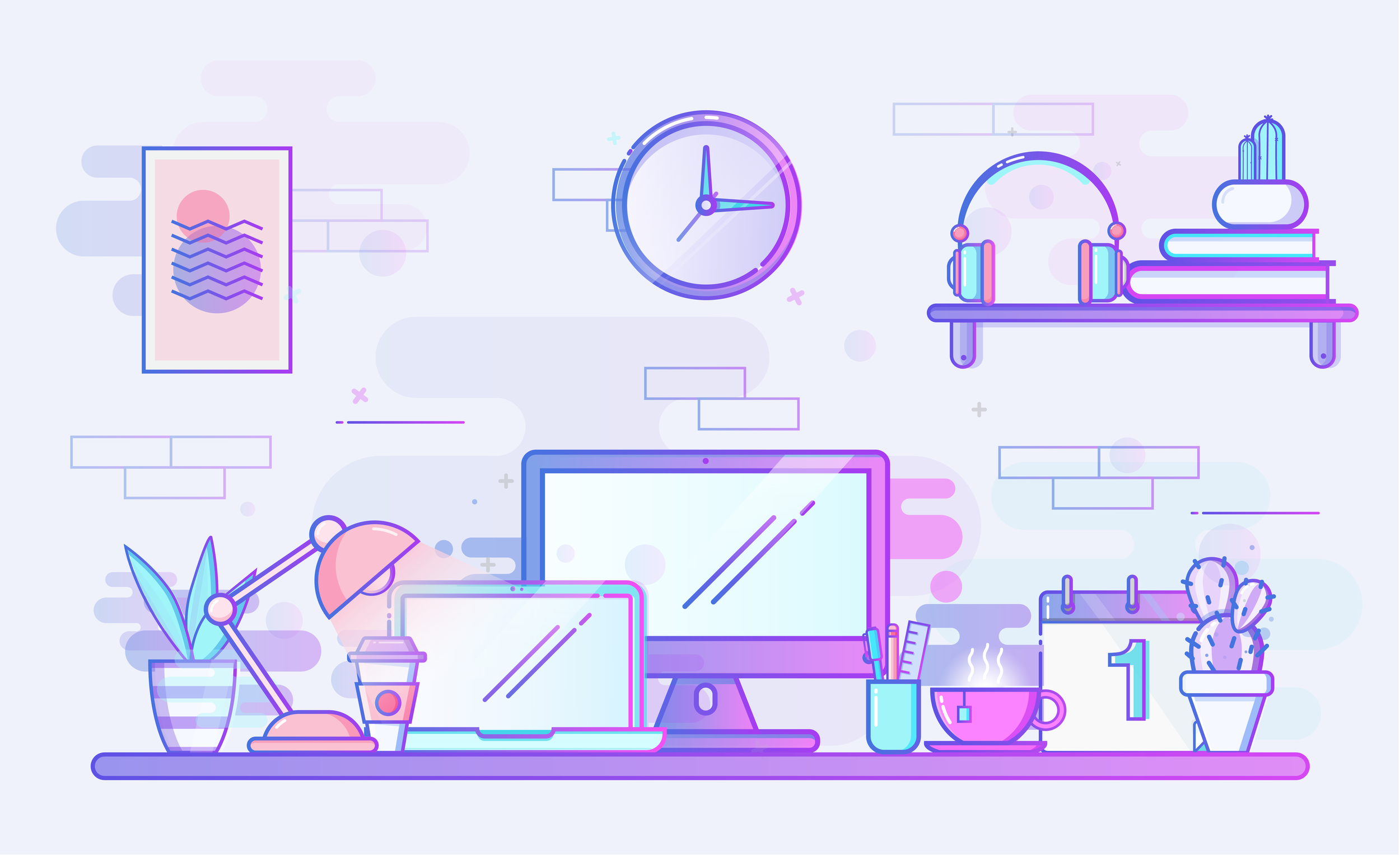
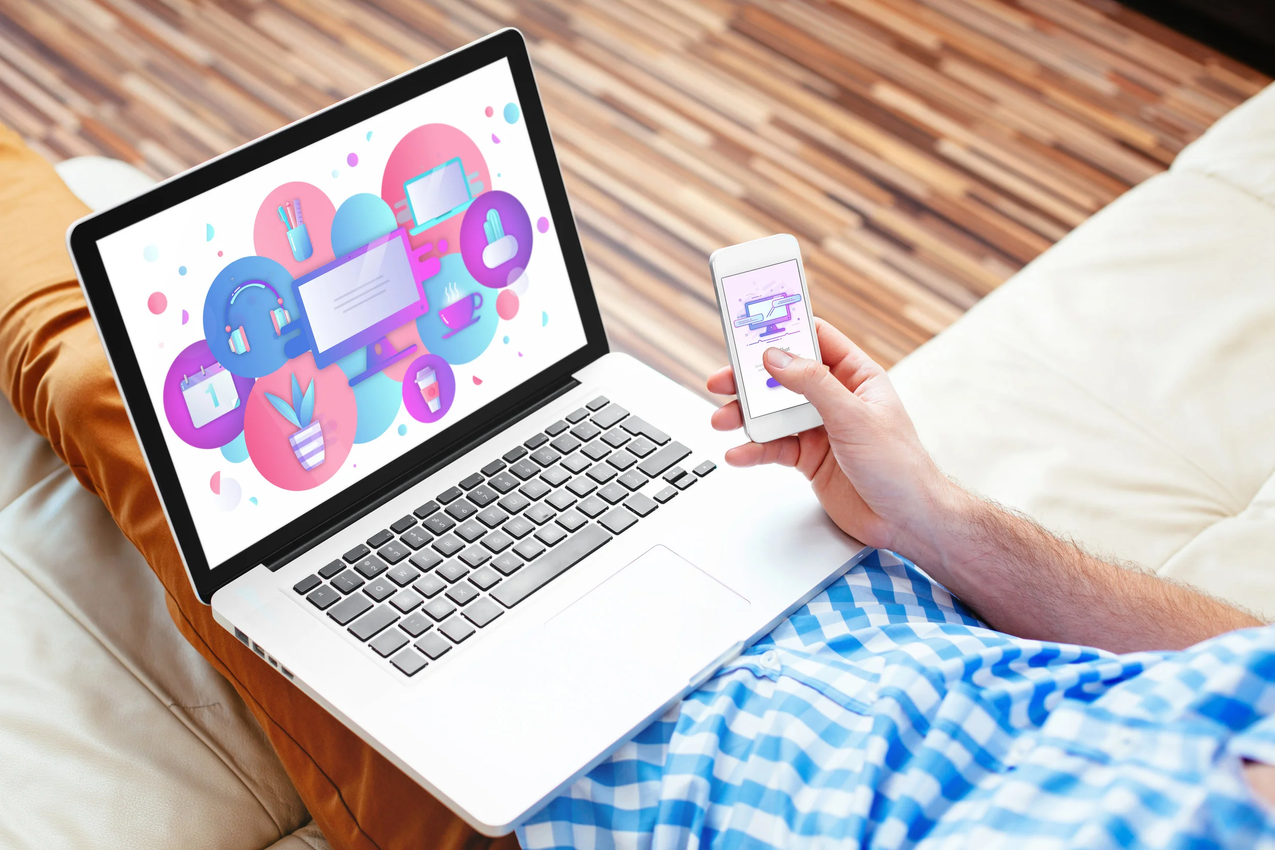
Eager to improve my skills in Illustrator, this project helped me understand the process of building a holistic, stylized set of icons. Created in both a flat and line design style, these colorful workspace icons can be used universally across web, print, and/or phone application platforms.
S K I L L S
Adobe Illustrator
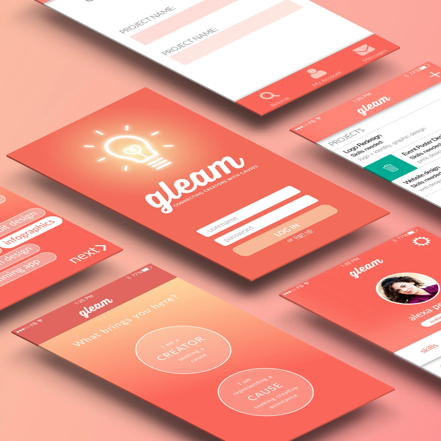
G L E A M
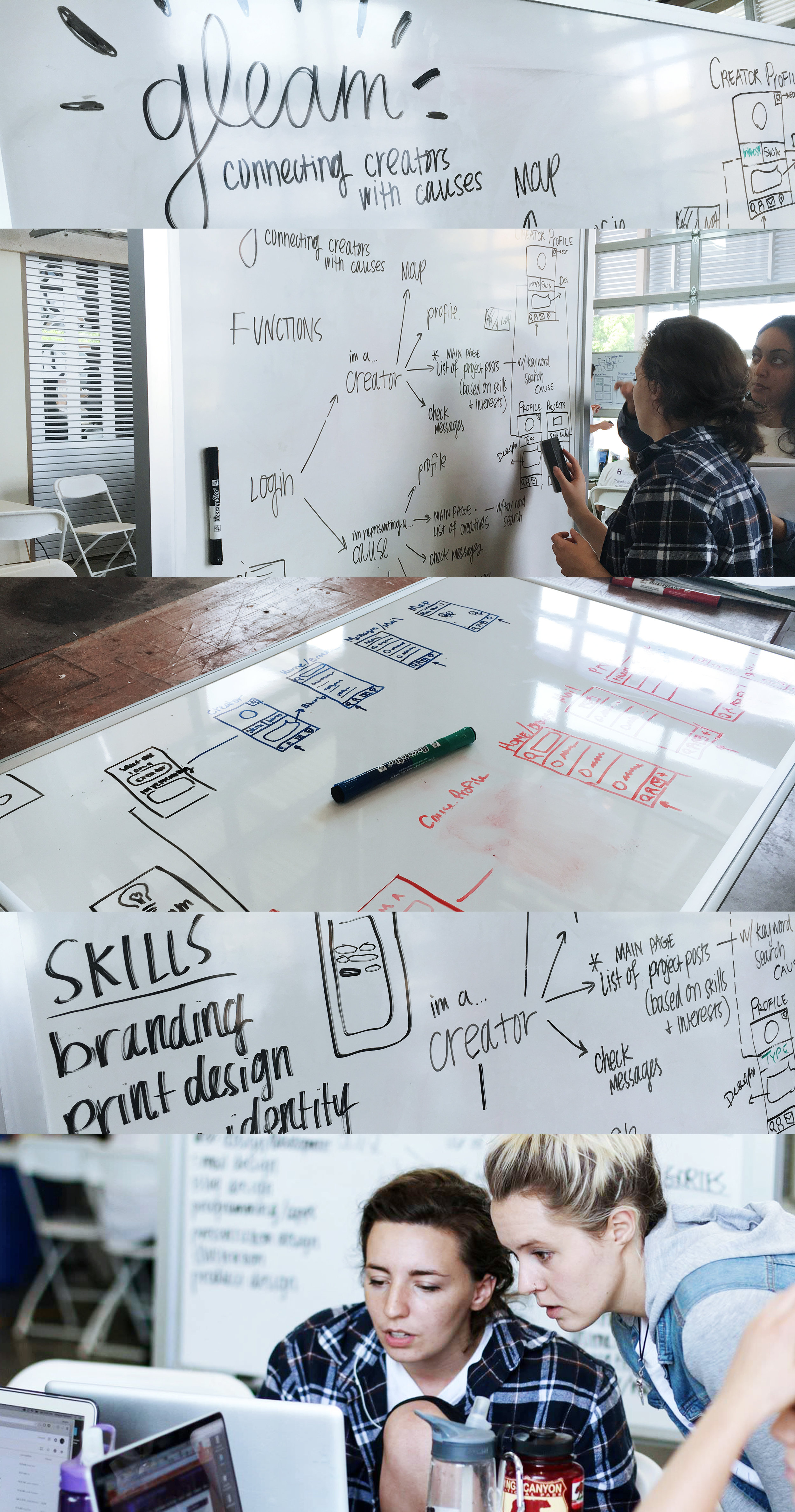
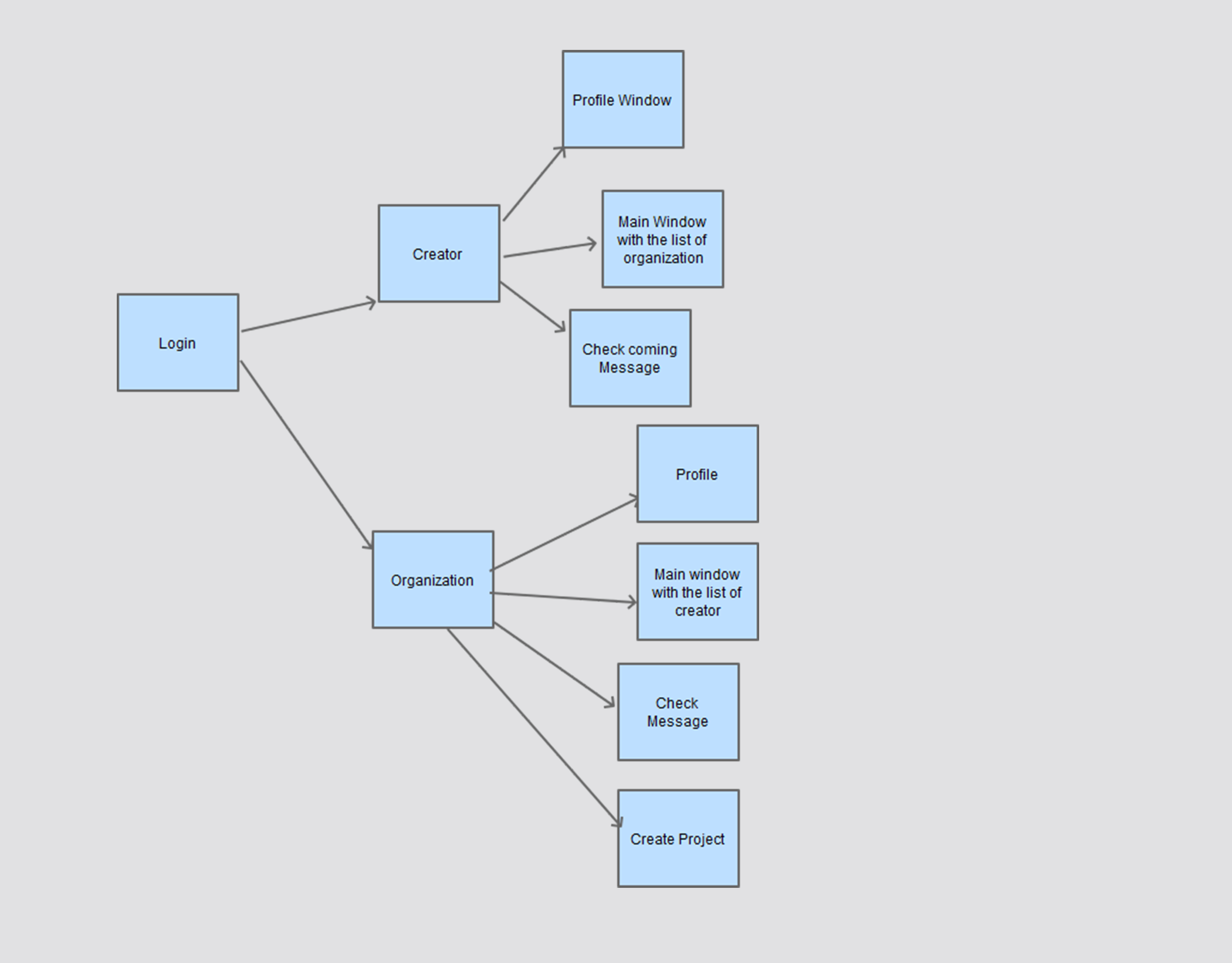
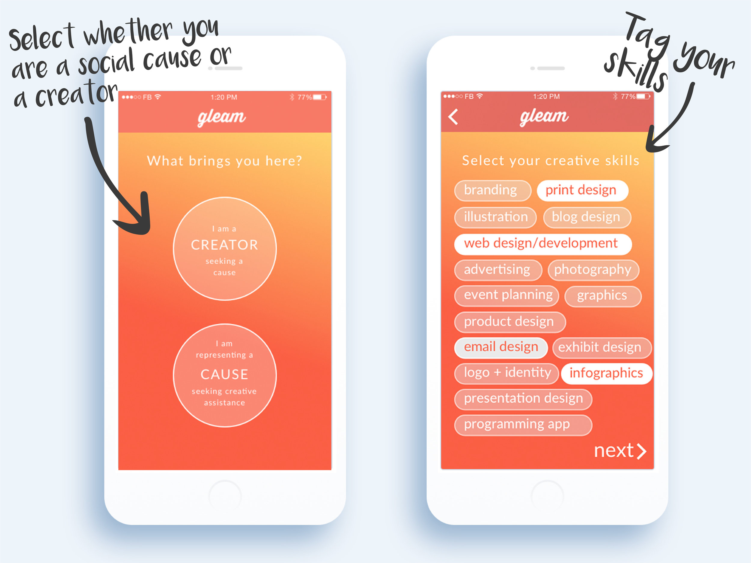
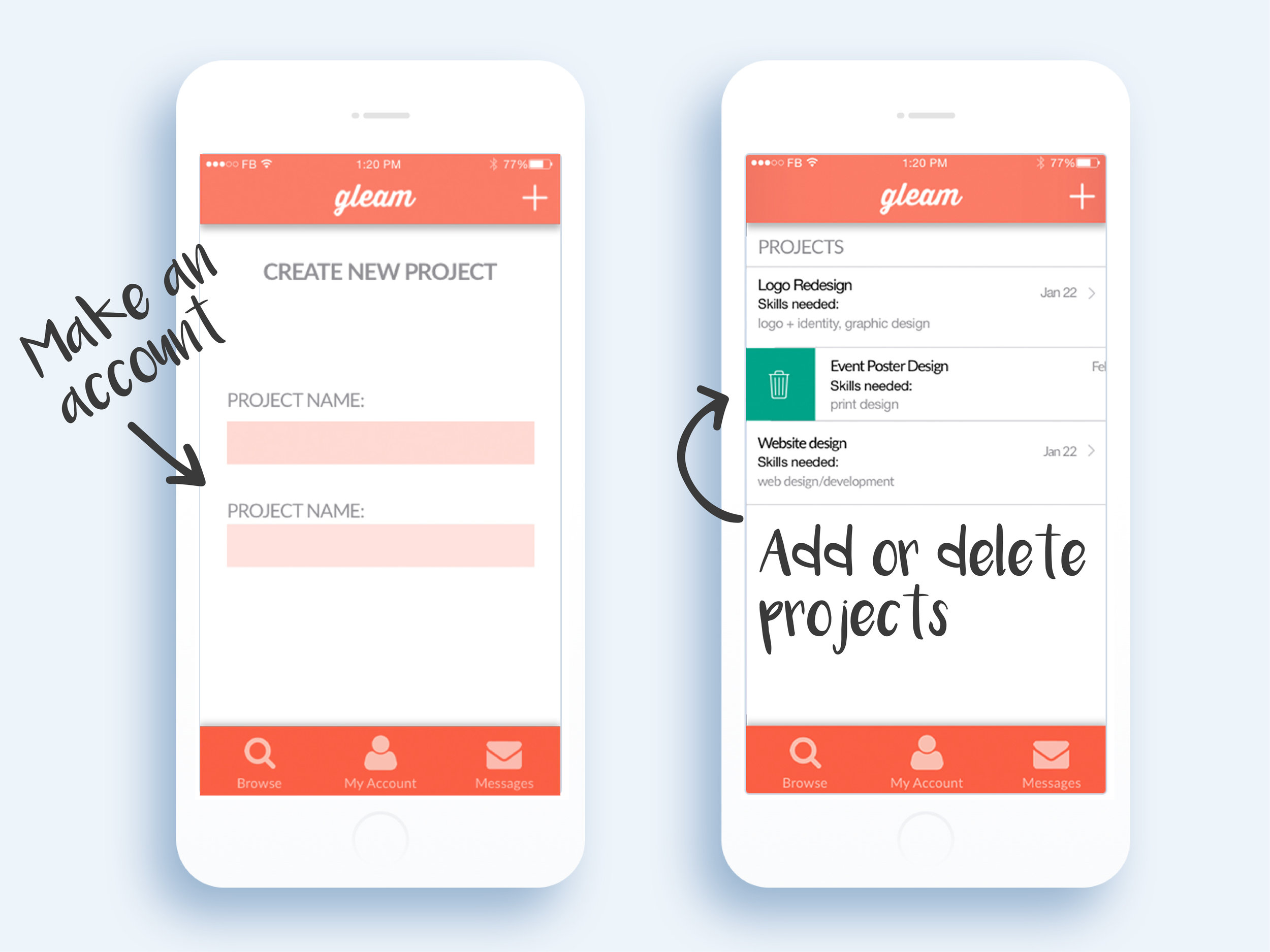
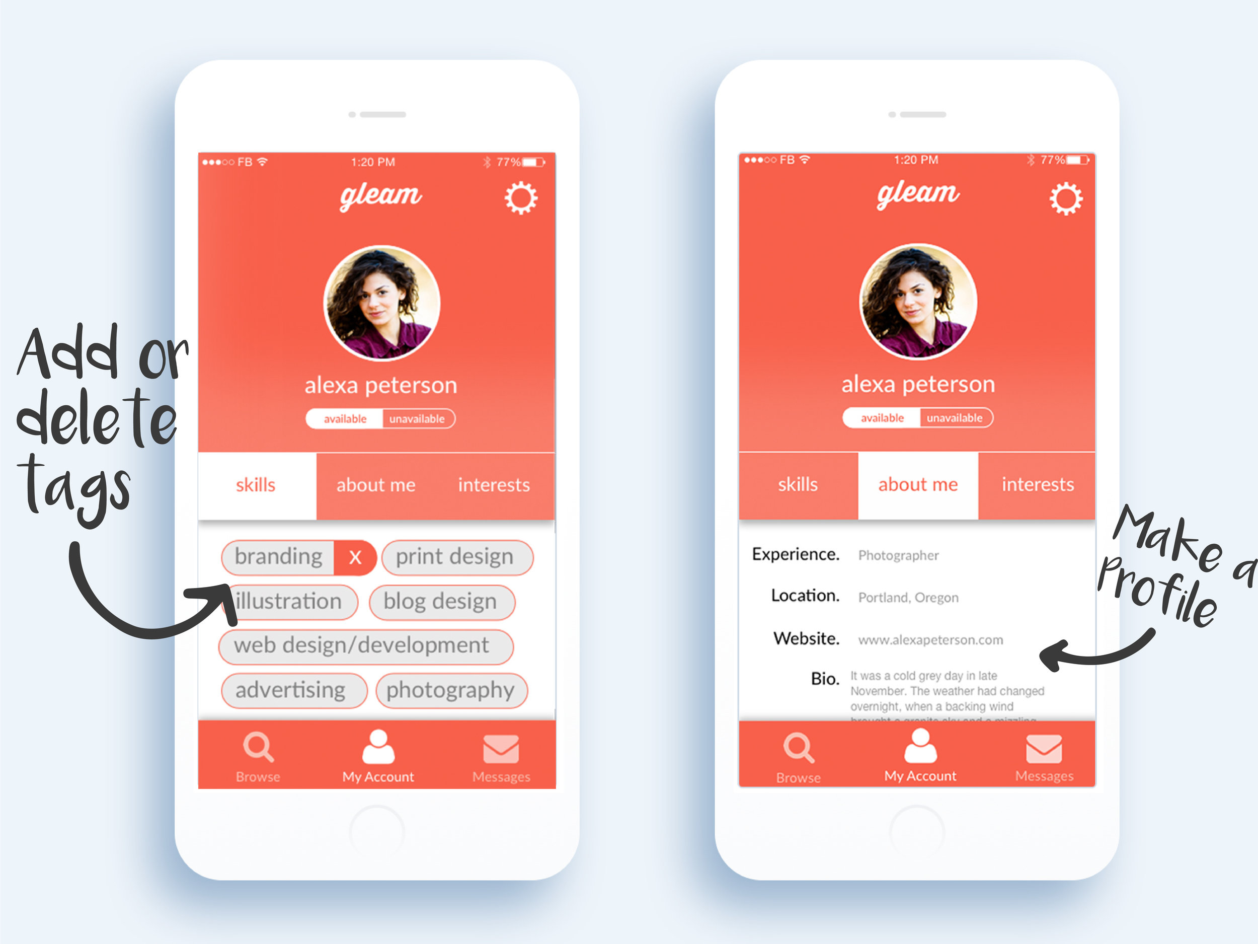
While competing in the 2016 Design and Dev Hackathon at Cal Poly, my team and I created an application that could connect designers to social causes. Designed and developed by the team within 24 hours, our application, Gleam, won an Honorable Mention for Development. We had designed an application for both Android and iOS mobile devices, as well as a fully functioning companion website to go with it. My main role throughout the process was executing and planning the UI design. This included designing icons, creating the logo, building wireframes, and pitching overall theme ideas. This event not only allowed me to understand how applications are created and the many stages they go through before completion, but also enabled me to appreciate the value of close team collaboration so critically necessary to achieve a common goal. The award we received at the end and the team bonds that were formed in the process, were a true testament to that success.
S K I L L S
Sketch
Adobe Illustrator
Wireframes
Application Design
Logo Design
H A N D - C O D E D W E B S I T E
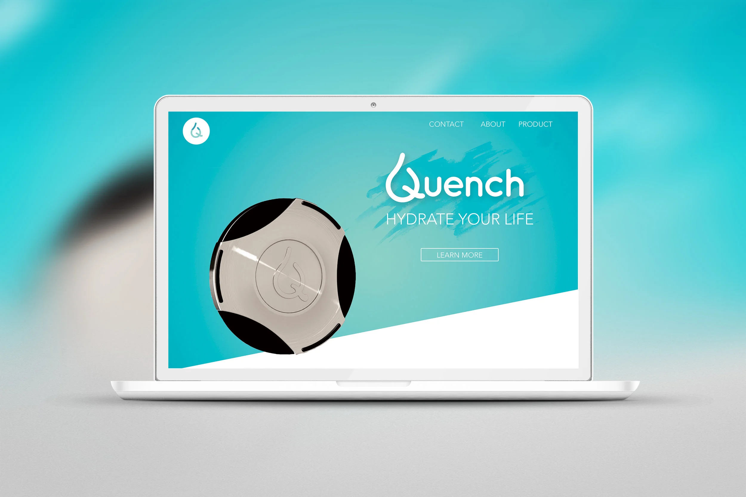
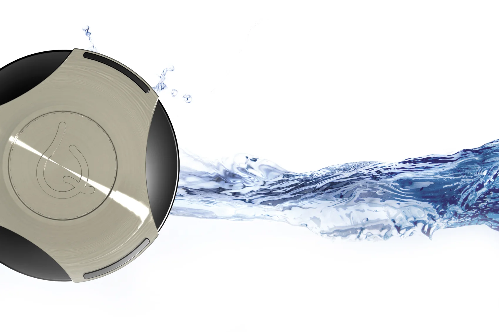
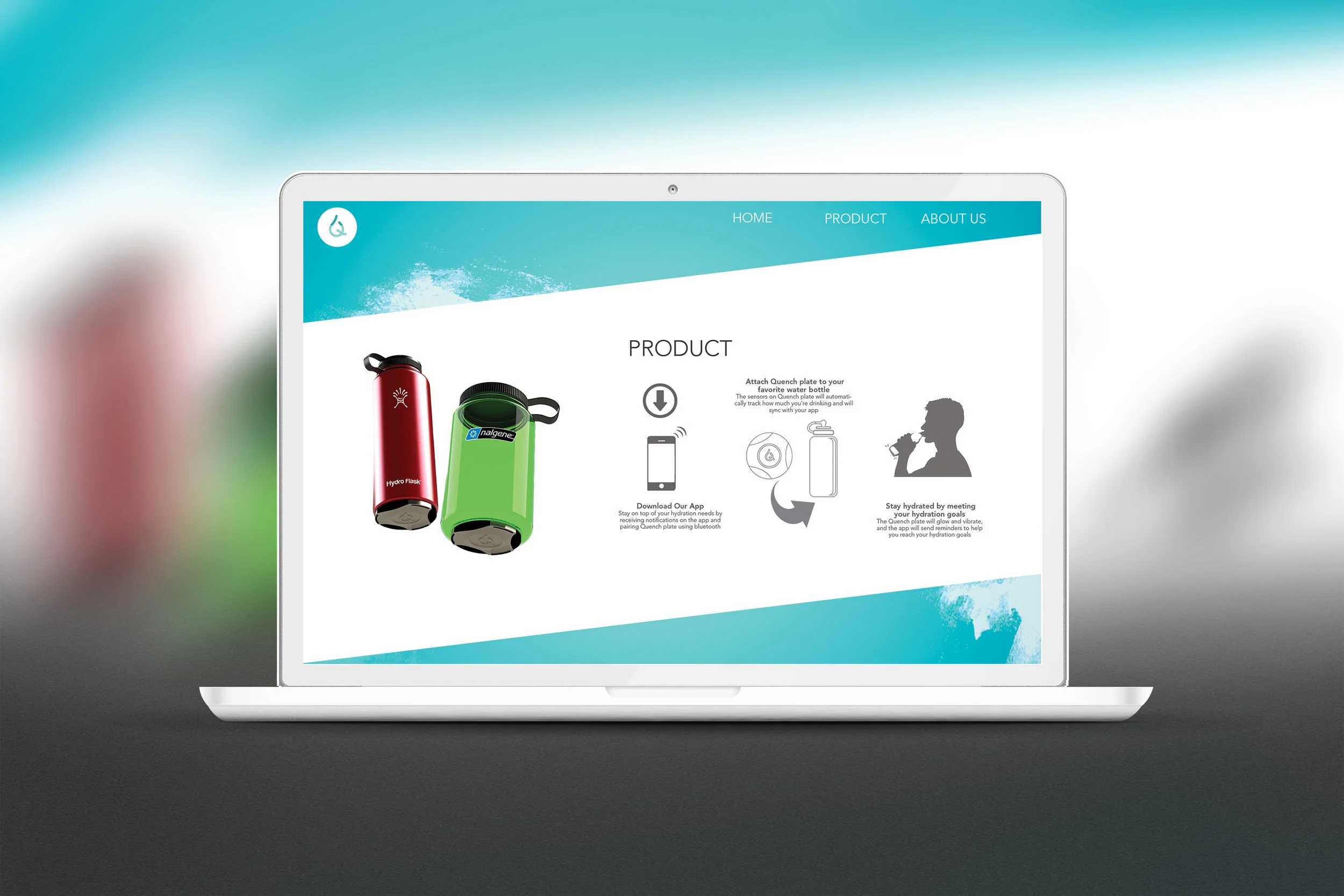
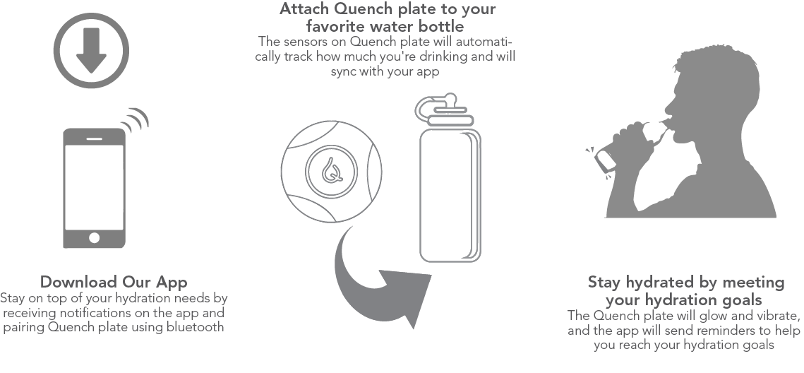
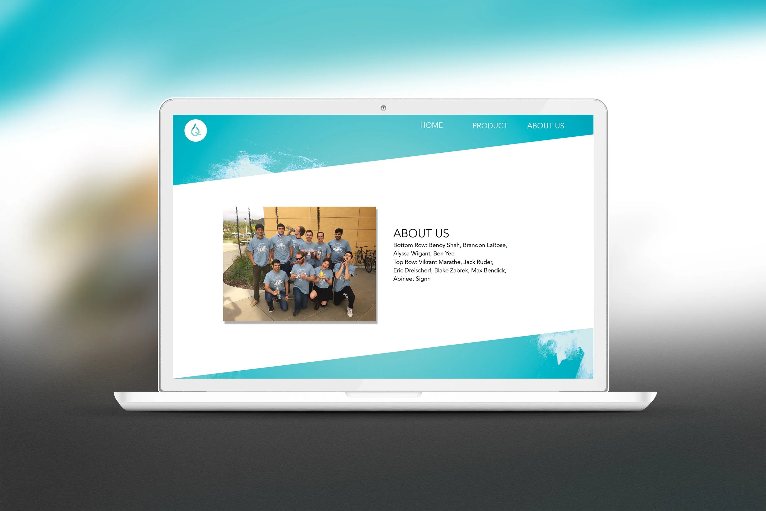
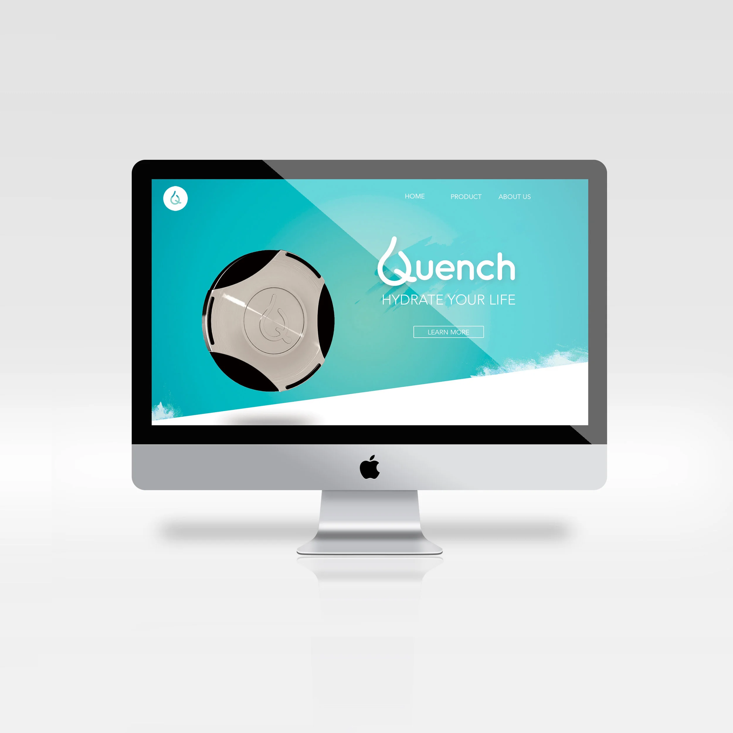
This fully functioning website was coded from scratch for a startup called Quench. The product utilized revolutionary sensor technology attached to a water bottle that automatically tracks the amount of water being consumed. It included Bluetooth pairing capabilities, glowing and vibrating technology, as well as a mobile app to provide additional controls and richer user interface.
I was both excited by the product and passionate about the importance of hydration. I created and coded the company’s website such that it functioned as a way to clearly introduce the product and establish its value proposition in the market. This project further allowed me to understand many basic aspects of code like CSS3, HTML, and Javascript.
S K I L L S
HTML
Javascript
CSS
Adobe Dreamweaver
Adobe Photoshop
G R A P H I T E & I N K D R A W I N G
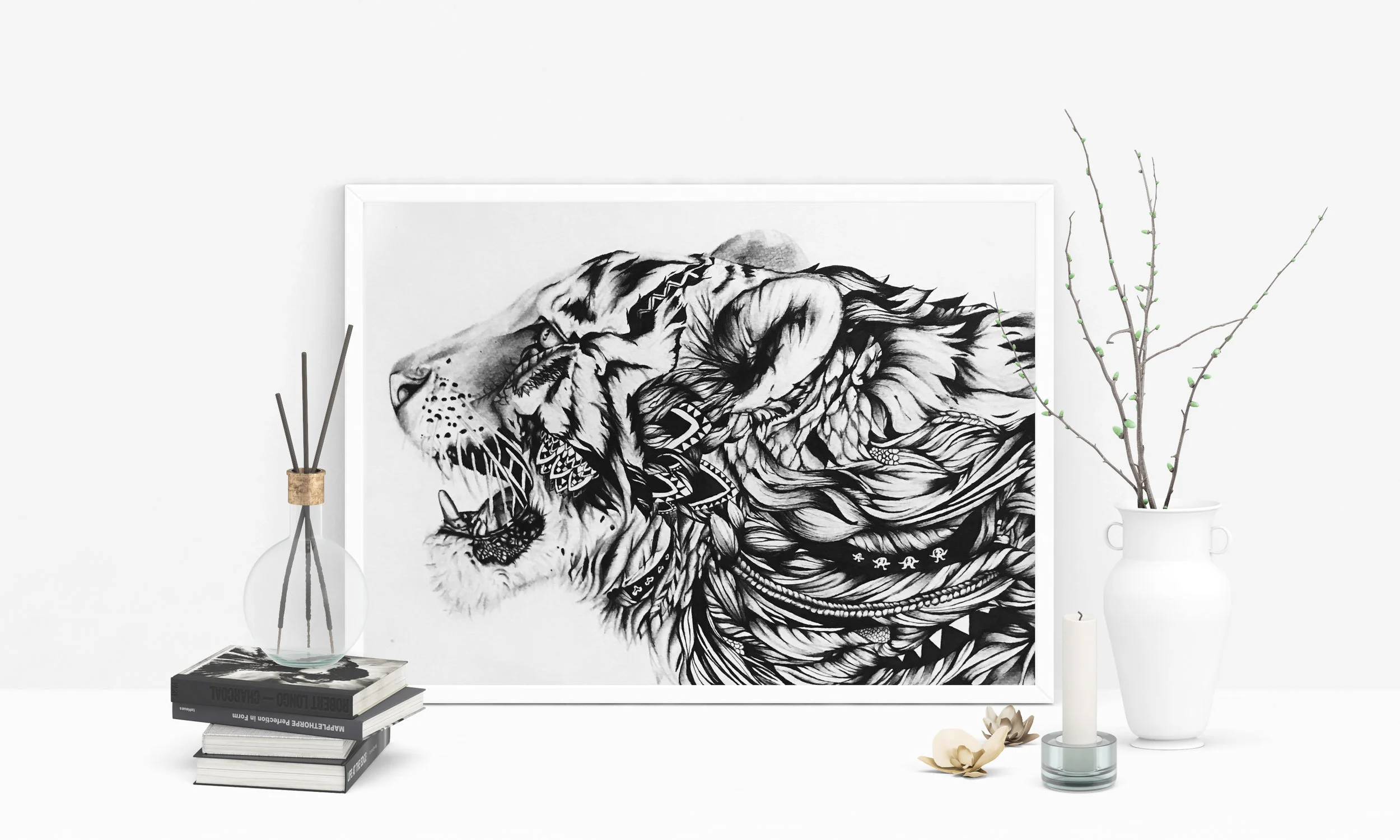
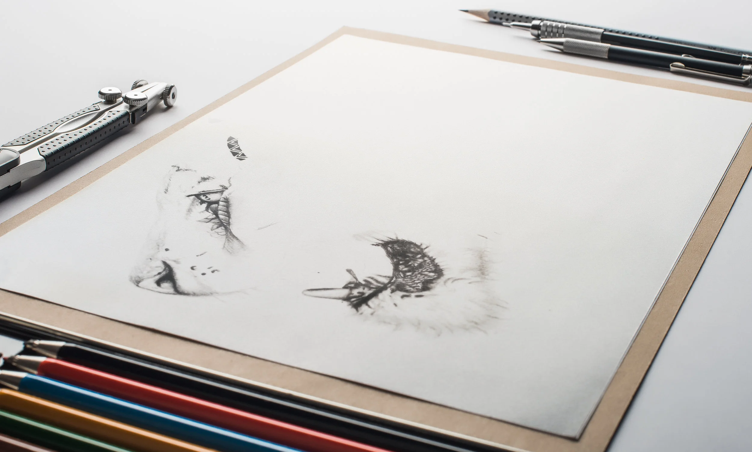
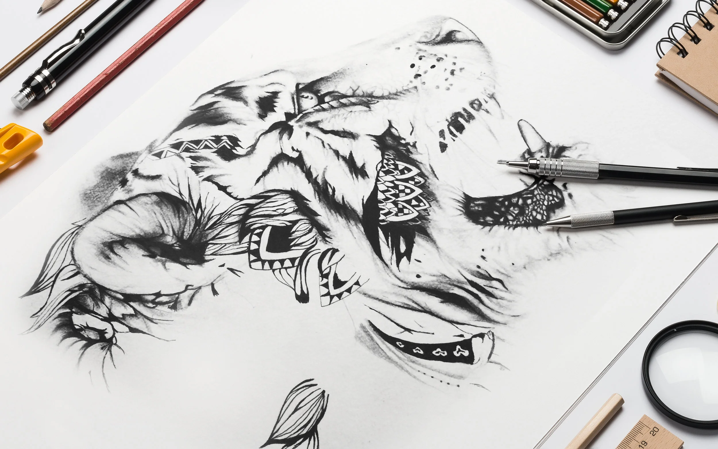
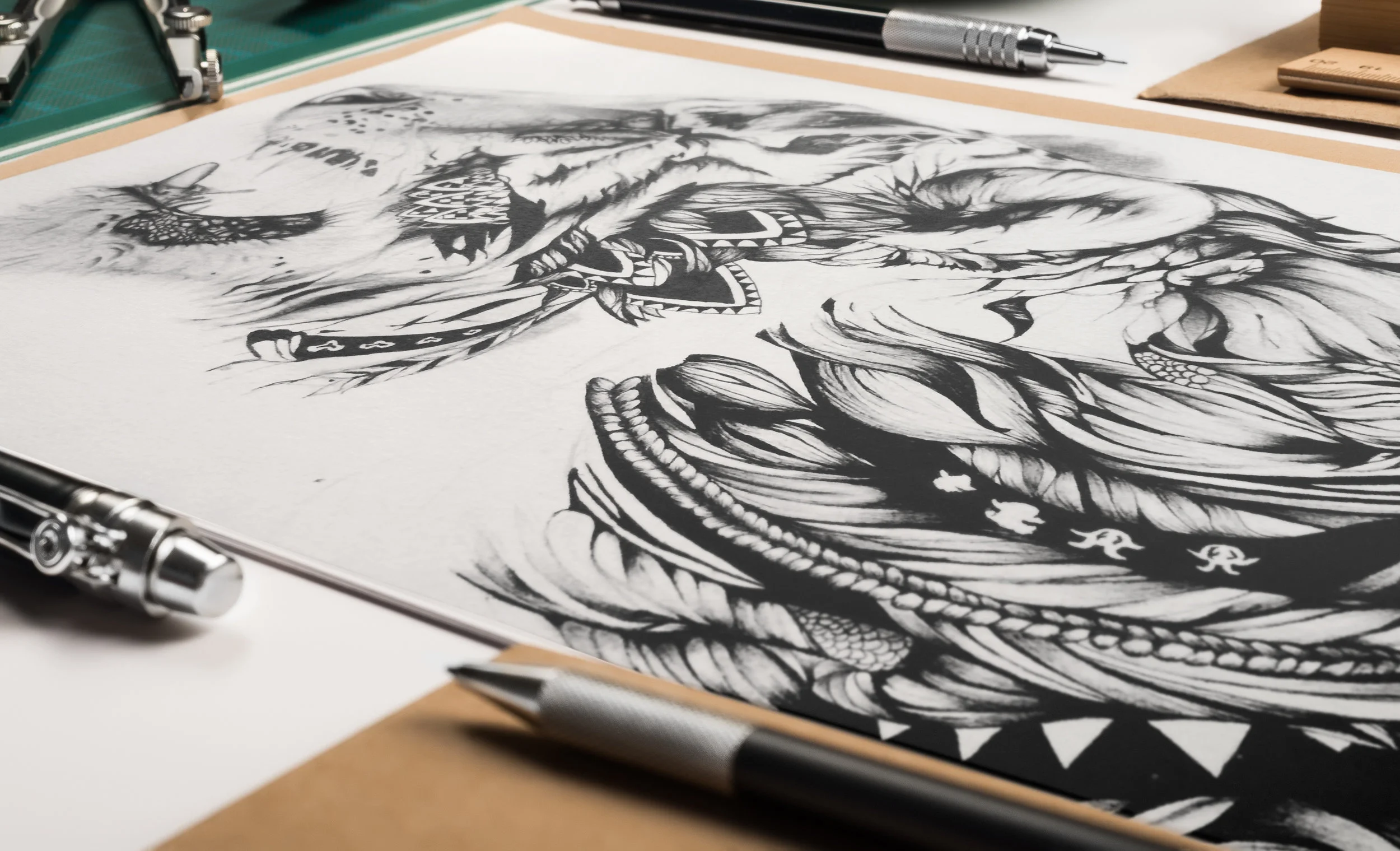
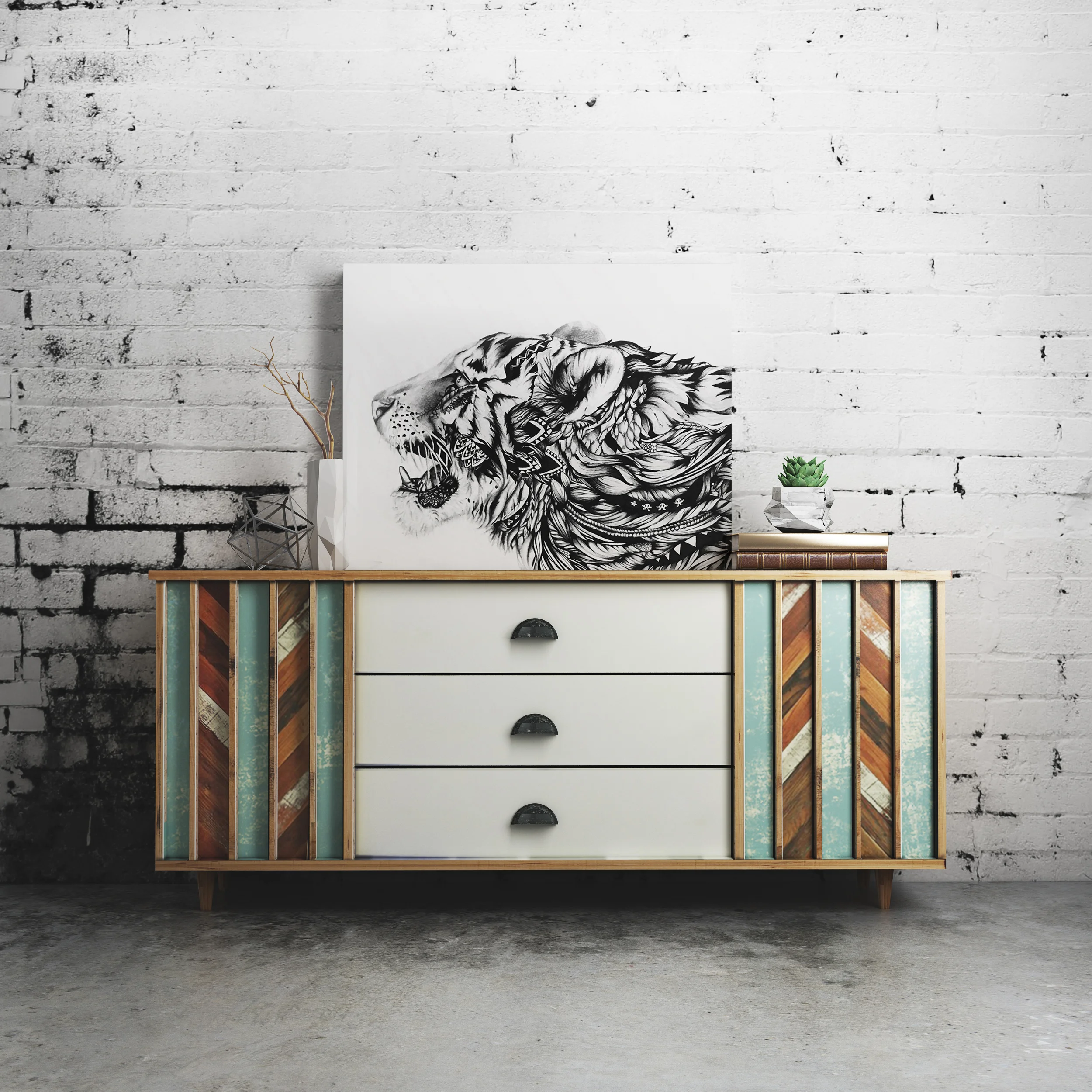
Combining design elements and basic drawing knowledge, comes a hand-drawn tiger assembled through realistic anatomy embellished with imagined design patterns. Heavily influenced by Svetlana Ledneva-Schukina’s amazing wildlife illustrations, this drawing is 11x17 inches, created with pen, ink, and graphite. The piece was somewhat personal and inspired by a book I read as a kid, Life of Pi. In this book, its my opinion that the tiger, Richard Parker, represents Pi’s most animalistic instincts and his ultimate will to survive being stranded on a boat in the middle of the ocean with just a 450 pound Bengal tiger to keep him company. I think that everyone has this will, this magnificent beast inside of us that is awoken when we are in danger or going through some misfortune or adversity. And I find it rather beautiful that it is this will that allows us to keep going and not only survive, but also thrive. I think a tiger is the perfect metaphor to represent the greatness and stamina of the human spirit.
S K I L L S
Illustration
Graphite Sketching
Pen
Ink
M A G A Z I N E D E R I V E
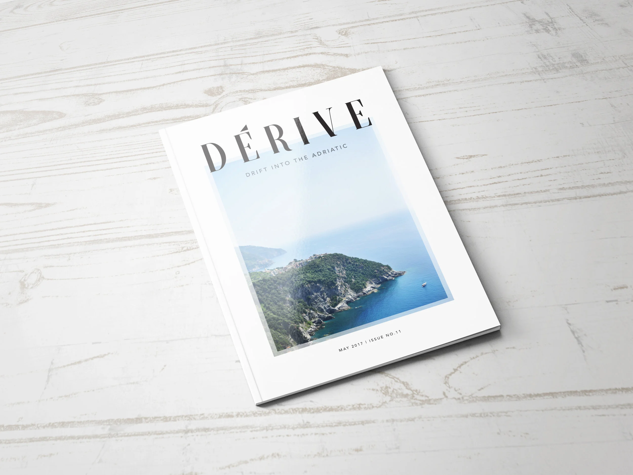
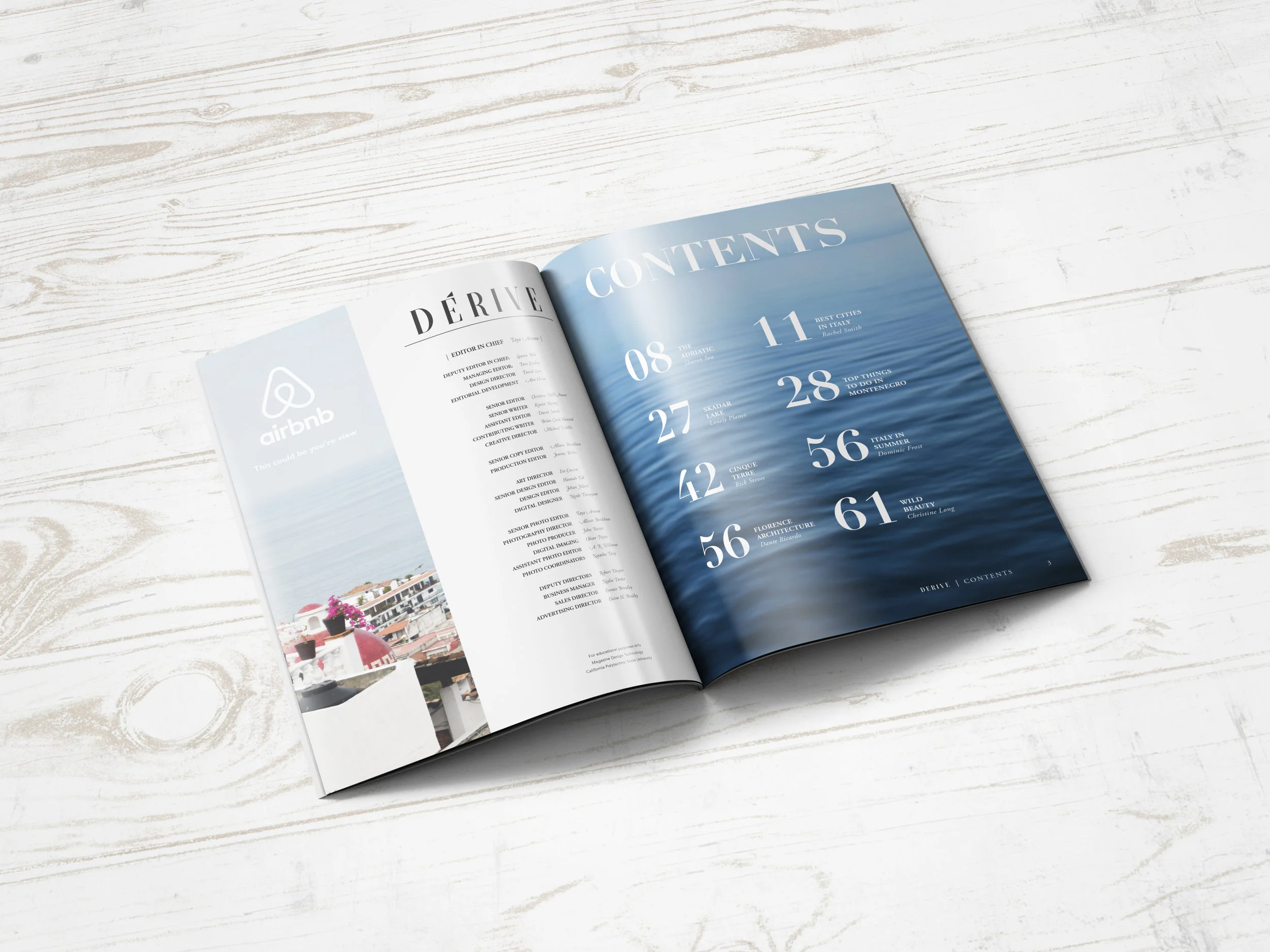
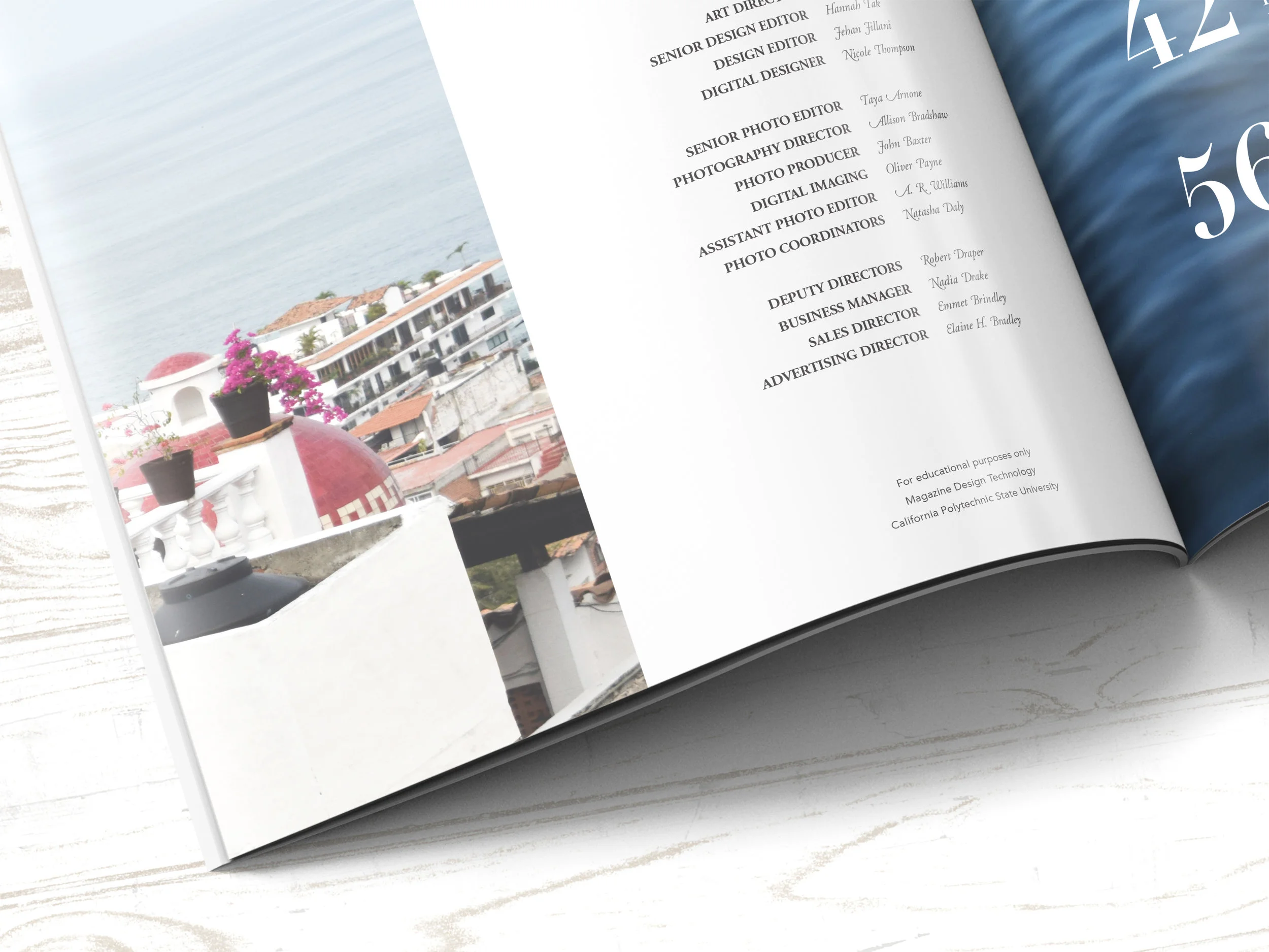
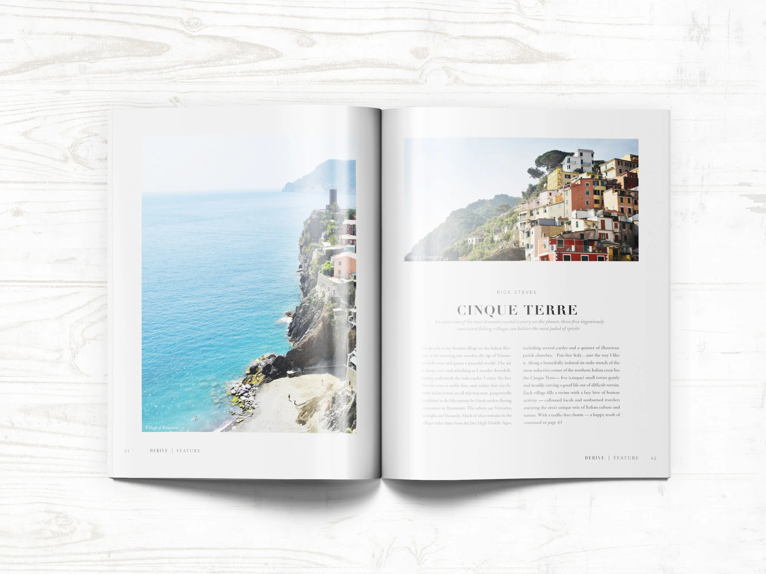
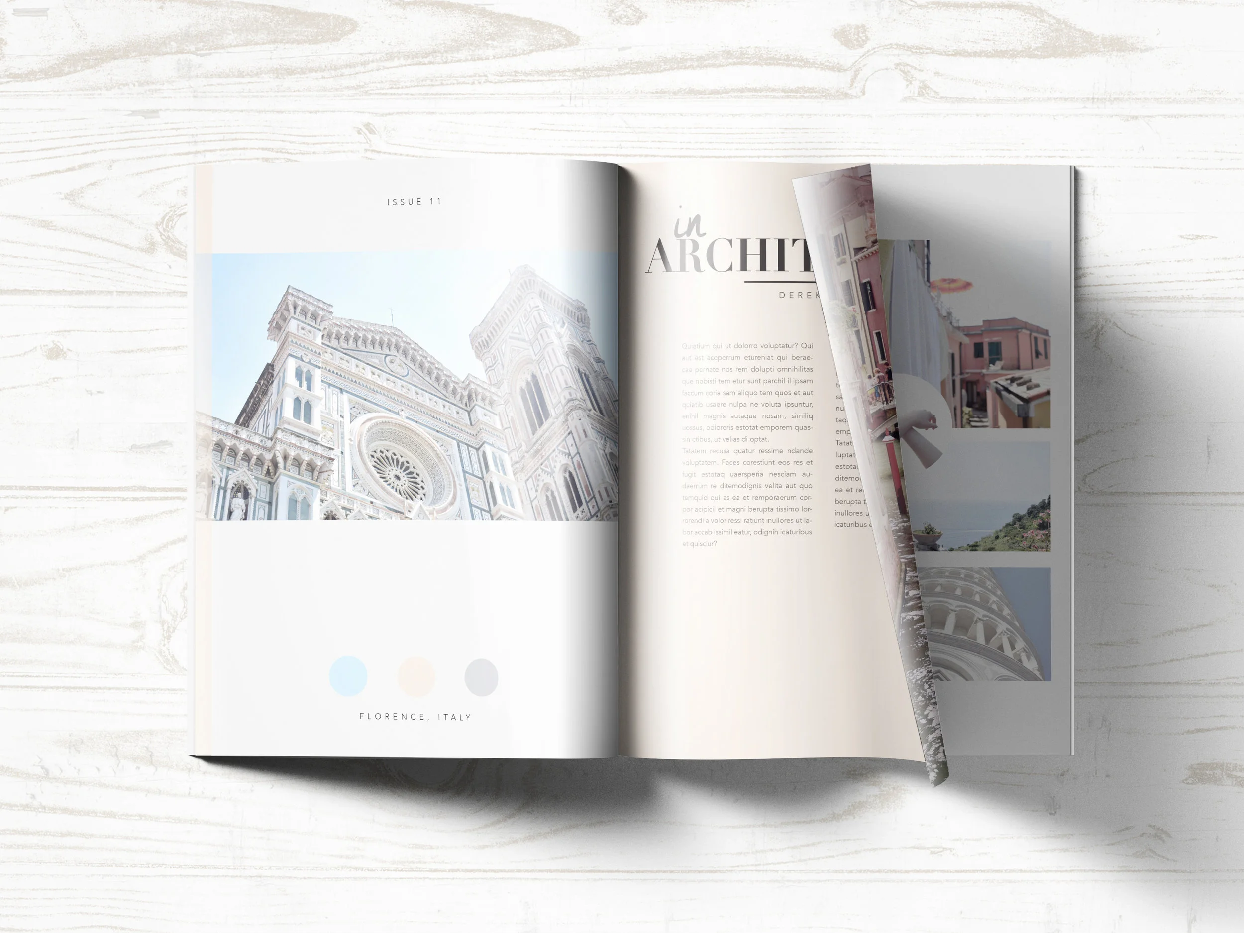
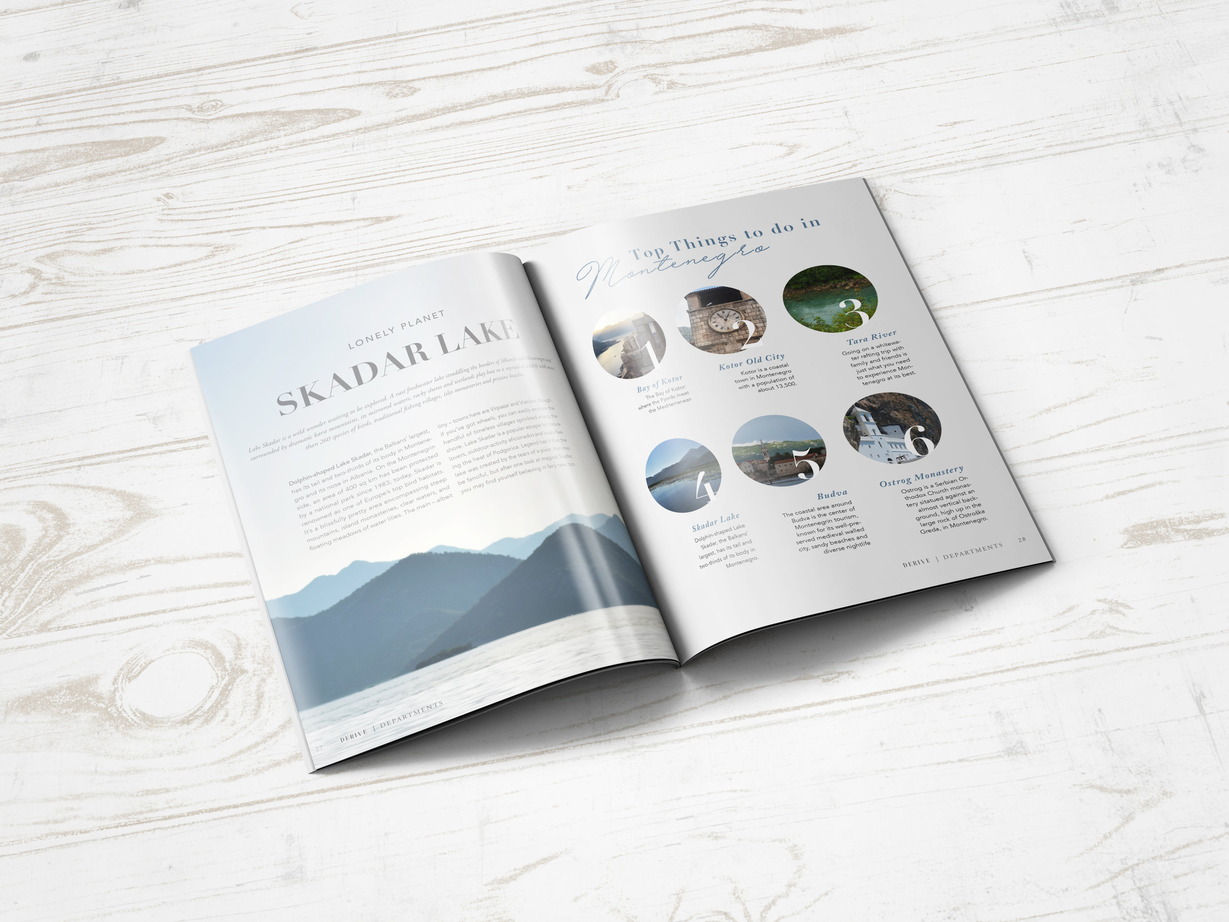
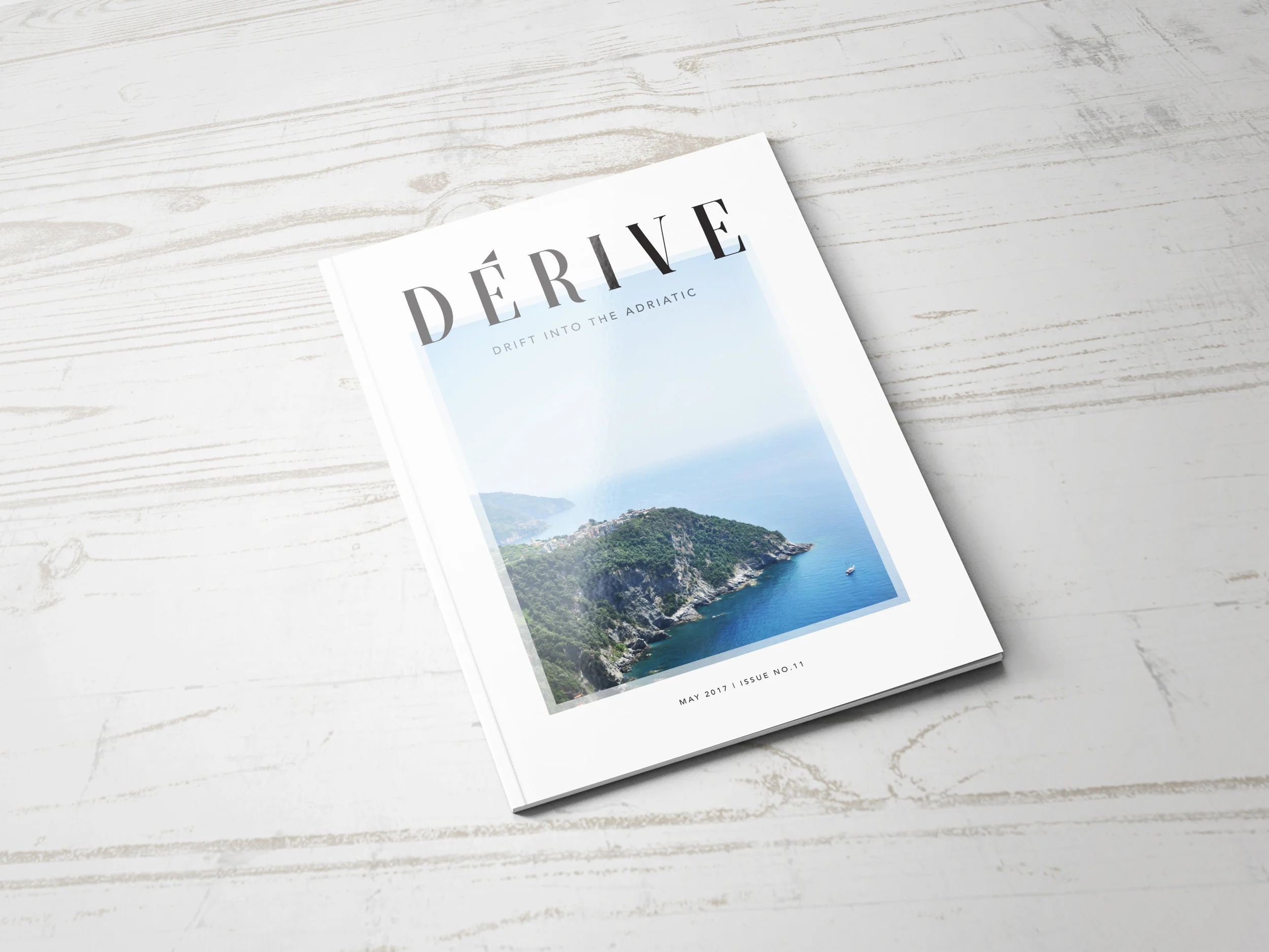
Derive is a high-end travel magazine created for those with a passion for exploration and travel. Inspired from my backpacking journey through Europe during the summer of 2016, I wanted to make something that captured the essence of the Adriatic Sea. ‘Derive’ is a French word meaning drift, which emulates the nature of this magazine being that it is all about relaxation and beauty. Using only my own imagery, Derive magazine highlights beautiful places like Cinque Terre and Florence, and also some lesser-known locations like Skadar Lake, Montenegro, and Tara River, Bosnia. Featuring articles from Lonely Planet, Michael Antony, and Julie March, this magazine fills its pages with architecture, poetry, hidden destinations, and traveling tips.
The design is generous in white space and relies heavily on imagery for the bulk of its content. The color scheme is mostly based around blue and white. Blue as been shown to produce a calming effect and is associated with tranquility, while white often represents cleanliness and light. This reflects and strengthens the soft tranquil theme, allowing you to drift through the Adriatic.
S K I L L S
Page Layout
Photography
Typography
Adobe InDesign
Adobe Photoshop
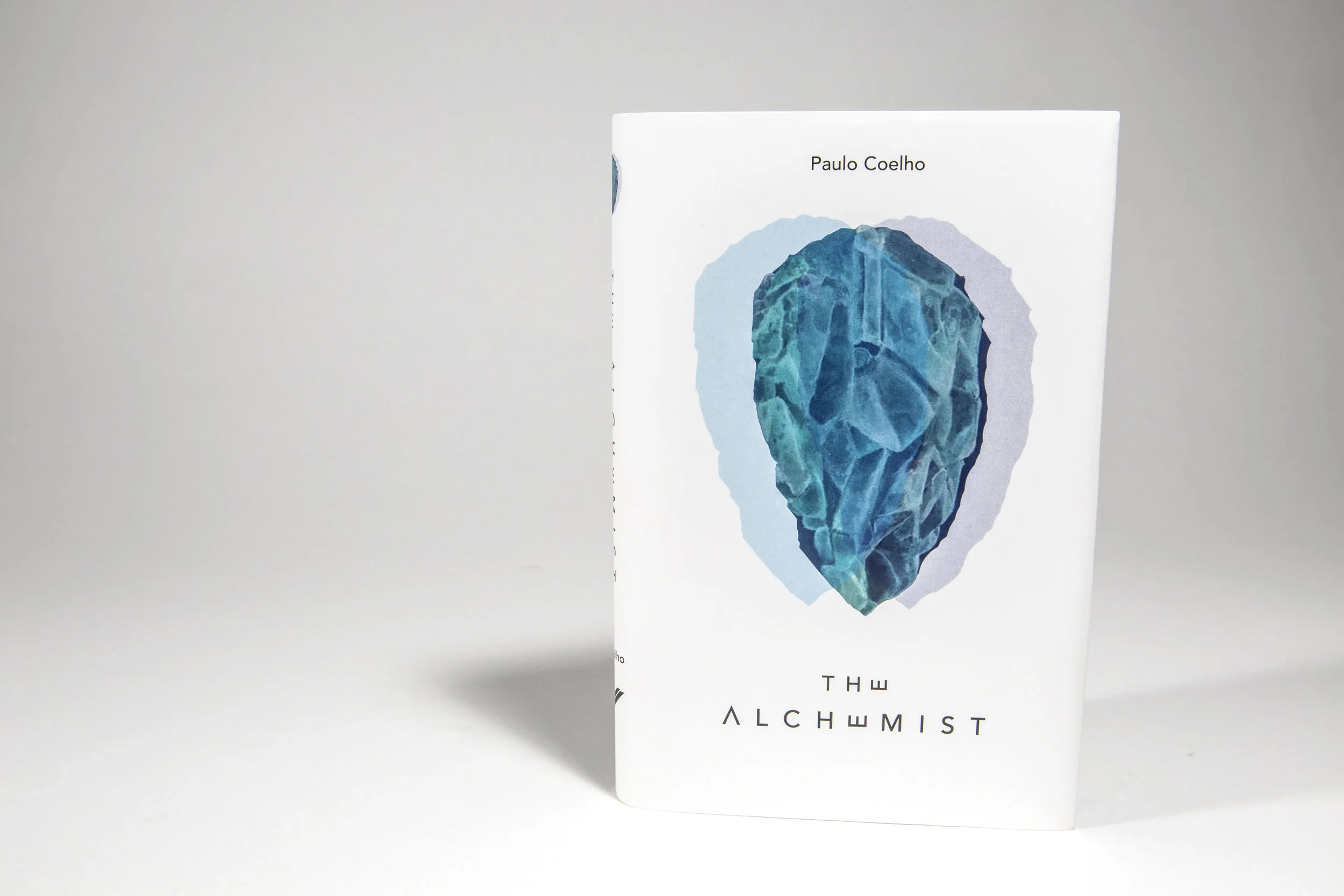
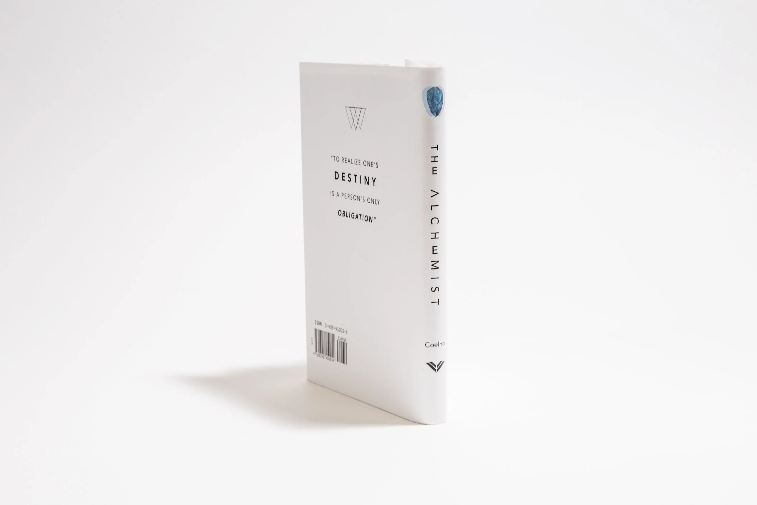
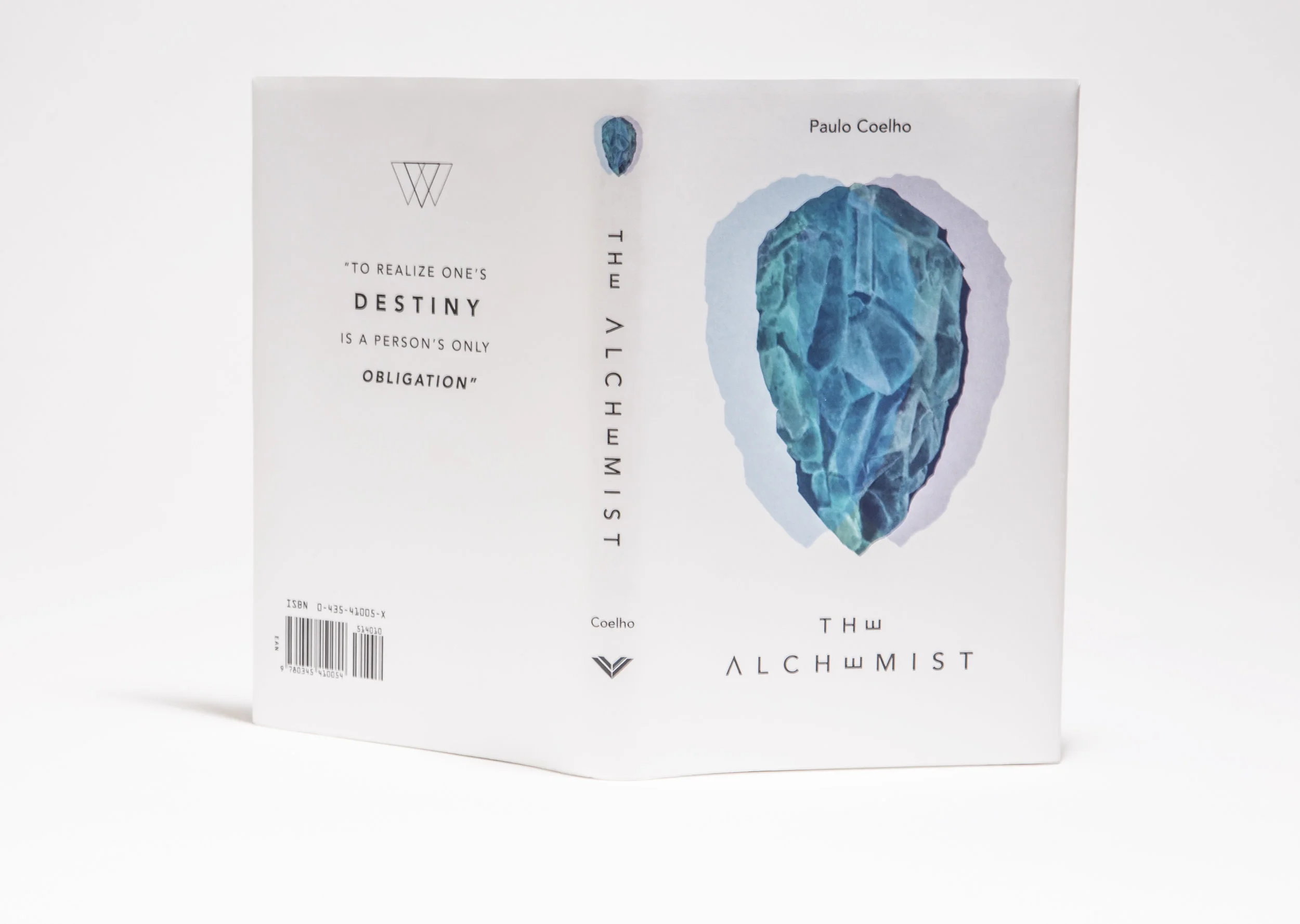
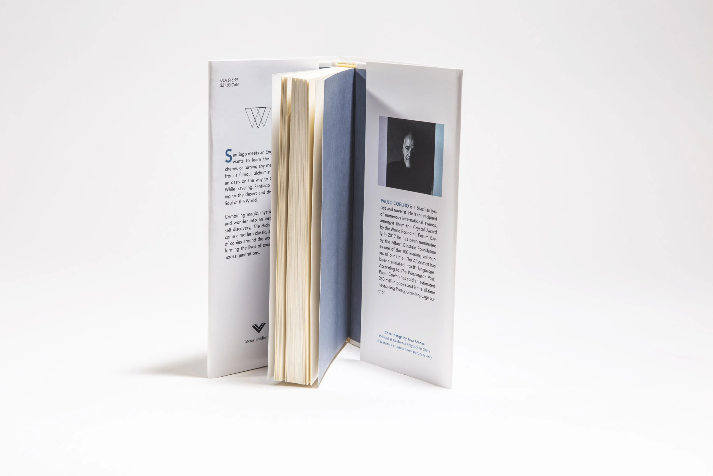
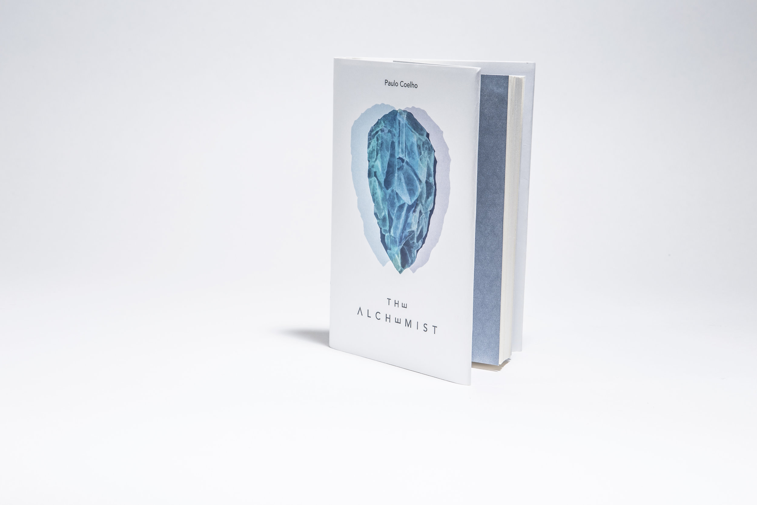
T H E A L C H E M I S T B O O K C O V E R
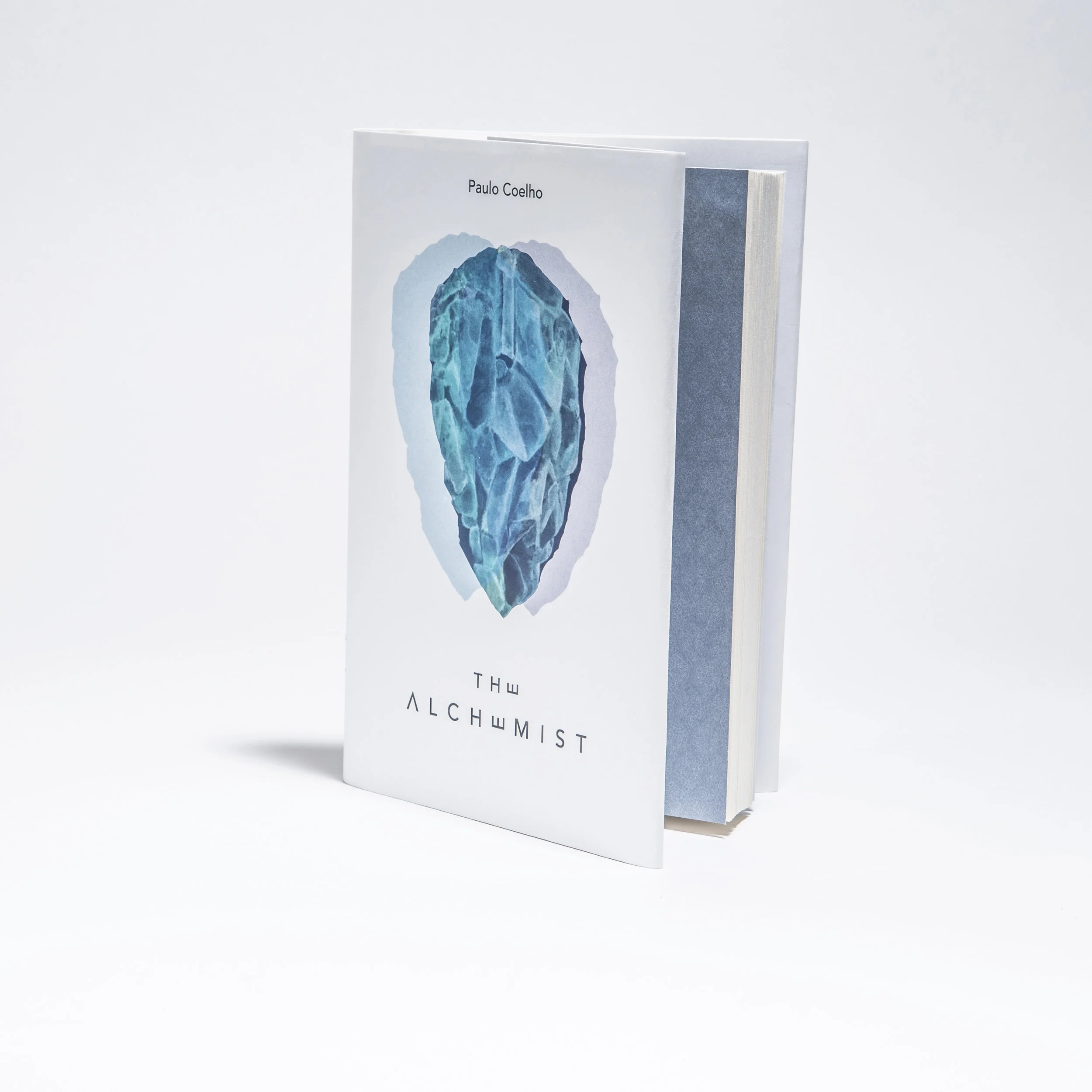
As part of a Book Design Technology course, I designed a book jacket for one of my all time favorite books, The Alchemist by Paulo Cohen. From a story with rich themes and sweeping imagery, I wanted the cover to be simplistic yet eye-catching, which also encompassed the overarching metaphors in the book. One of the key metaphors in the novel is the concept of the Philosopher’s Stone, a stone in which can turn any metal into gold. As a designer, I was truly captivated by this metaphor. I believe a designer’s job is somewhat similar: to turn something ordinary (or nothing) into something desired and treasured like gold.
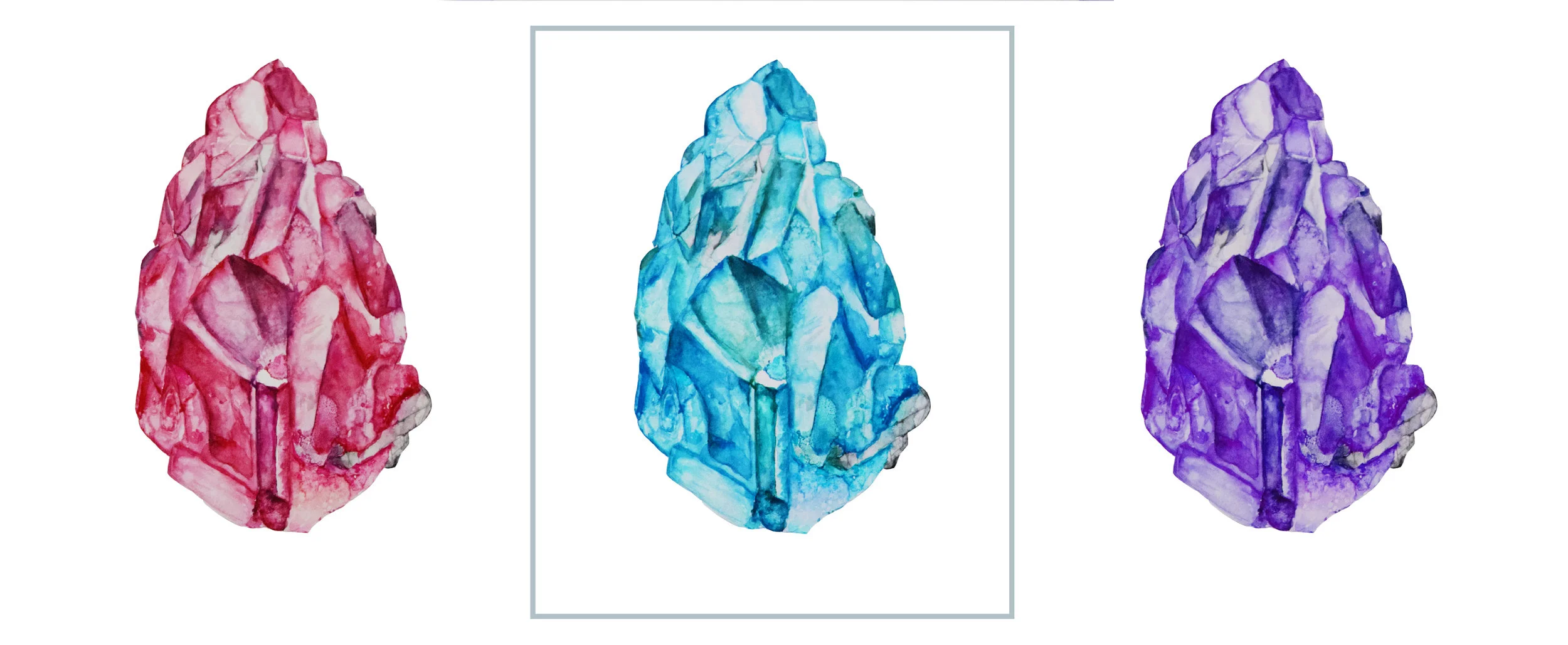
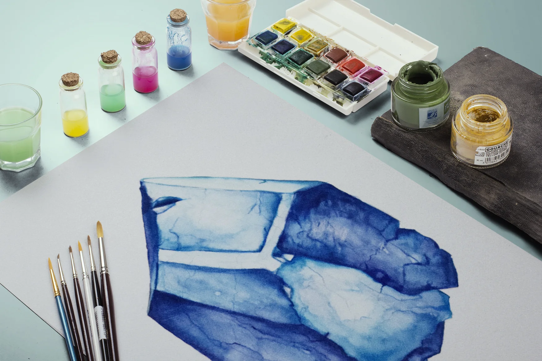
I had envisioned what I wanted the stone to look like, which I then water-colored by hand, scanned, and manipulated in Photoshop. Adding colors around the stone to bring the eye to the center of the piece allowed it to be the main focus. Along with the altered type treatment, the cover appears simple, elegant, and mysterious, much like the book itself.
For educational purposes only.
S K I L L S
Watercolor
Typography
Adobe Photoshop
Adobe InDesign
D I R E C T O R O F P H O T O G R A P H Y
The Cal Poly Hackathon (renamed to Camp PolyHacks) is a 2-day event where students from a variety of majors, and members of the SLO community collaborated to create an app/website/product to solve real civic-based issues with the help of our Community Heroes. After being a participant in the 2015 Hackathon event I was encouraged and inspired in 2016 to be involved again in a leadership role. After being appointed Director of Photography for the event, I was in charge of pulling a team of photographers and videographers together to memorialize the event. In this role, I was also responsible for securing sponsors, designing, facilitating, as well as other event duties. This was an inspiring project to be a part of and ended up being a huge success, with the city manager and mayor showing up for the final showcase.
After getting hours of footage and directing interviews, I had the privilege to make a video from the event for Cal Poly Liberal Arts and CP Entrepreneurs. This video footage has been used in additional advertisements for other Cal Poly educational events. This experience trained me in event planning and leadership, as I learned about the value of leading people and the rewards and challenges that it comes with. I was immensely proud of the documentation of the event, the photographers I had hired, and my fellow directors with what turned out to be an amazing event. The film was made using Nikon D3300 in Adobe Premiere Pro and After Effects.
S K I L L S
Videography
Steadicam
Photography
Leadership
Team Management
Event Planning
Recruiting Sponsors
Adobe Premiere Pro
Adobe After Effects
Adobe Photoshop & Lightroom
Click the play button!
H A N D M A D E B O O K
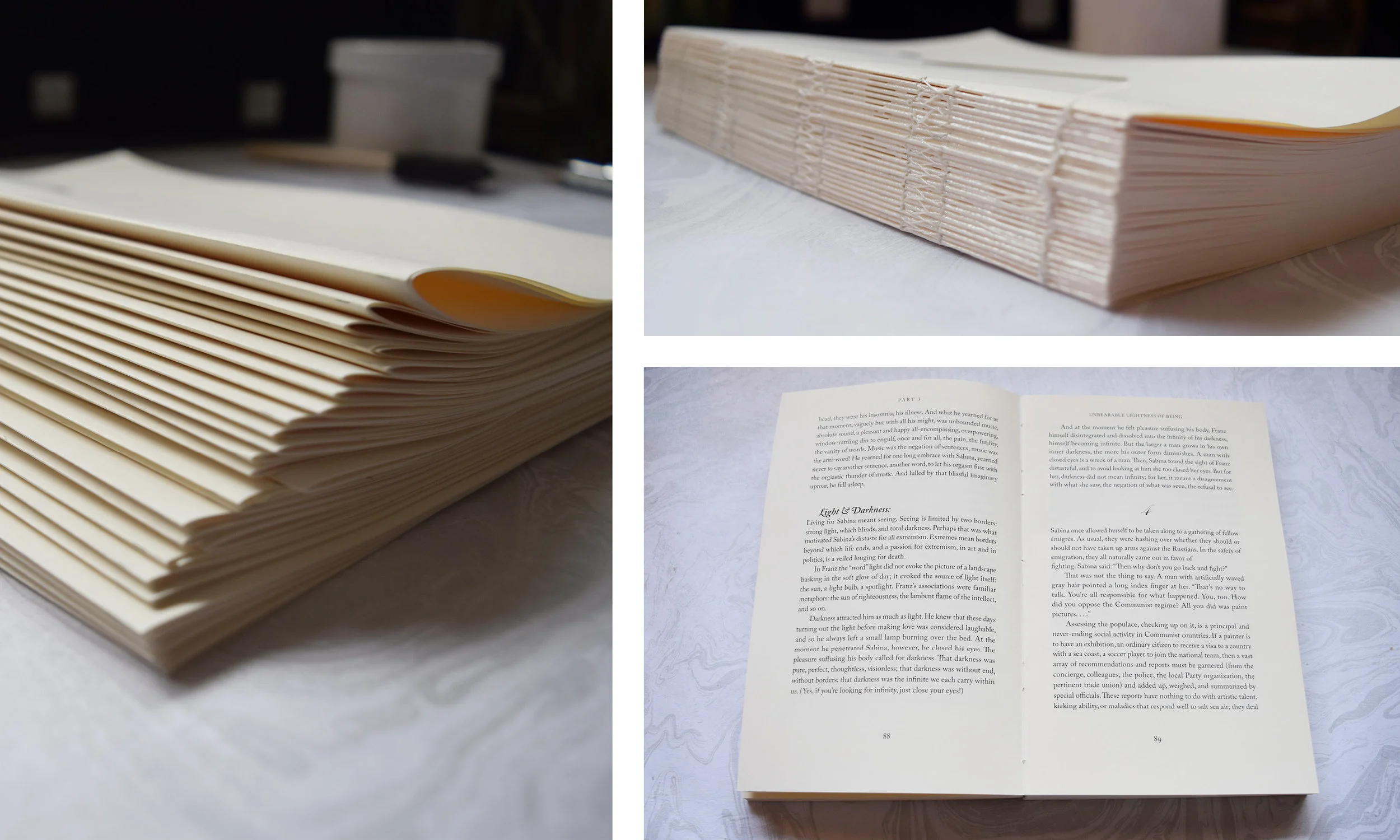
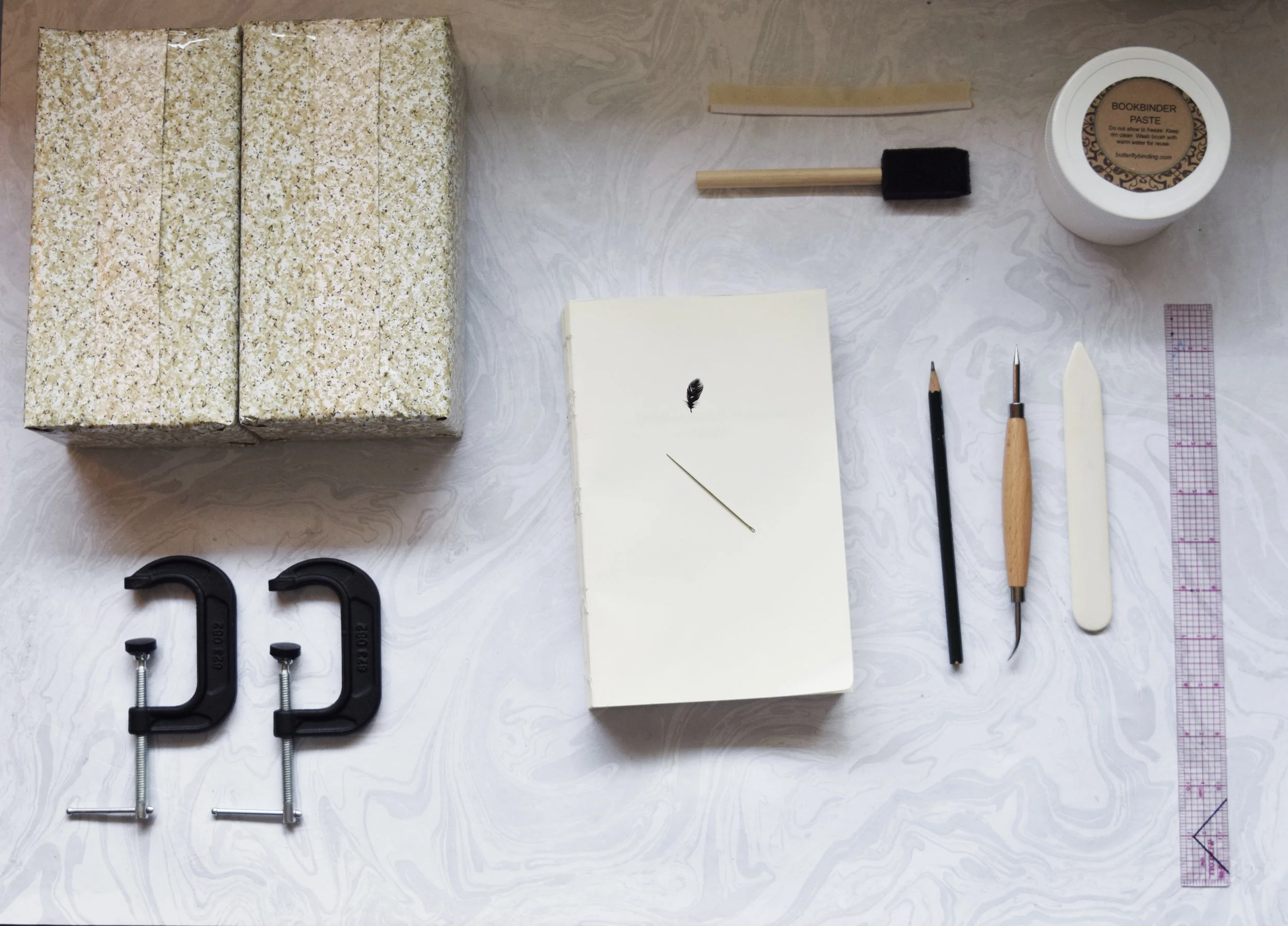
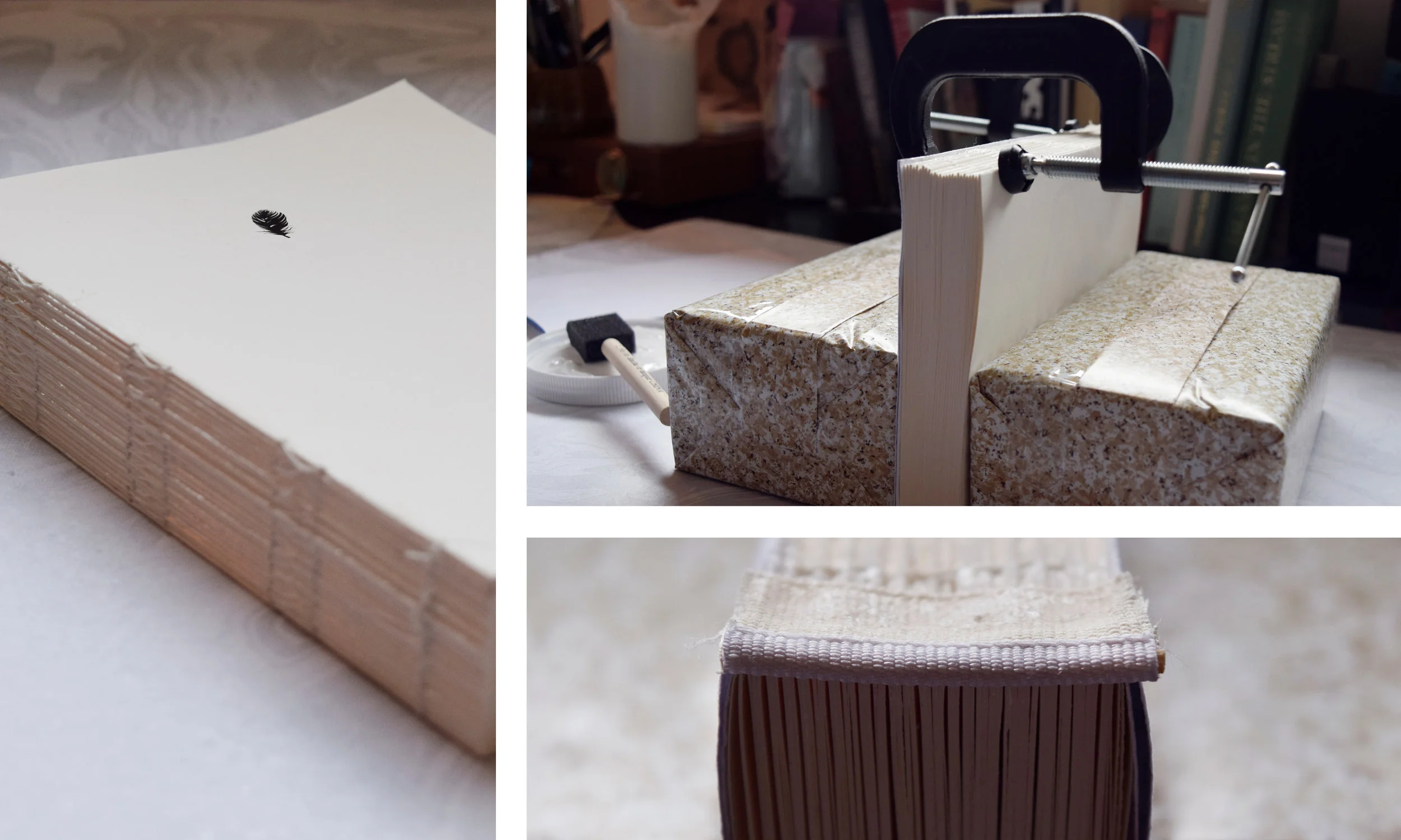
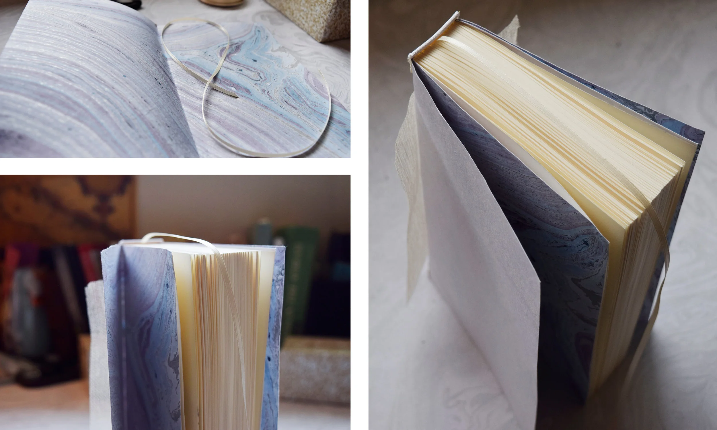
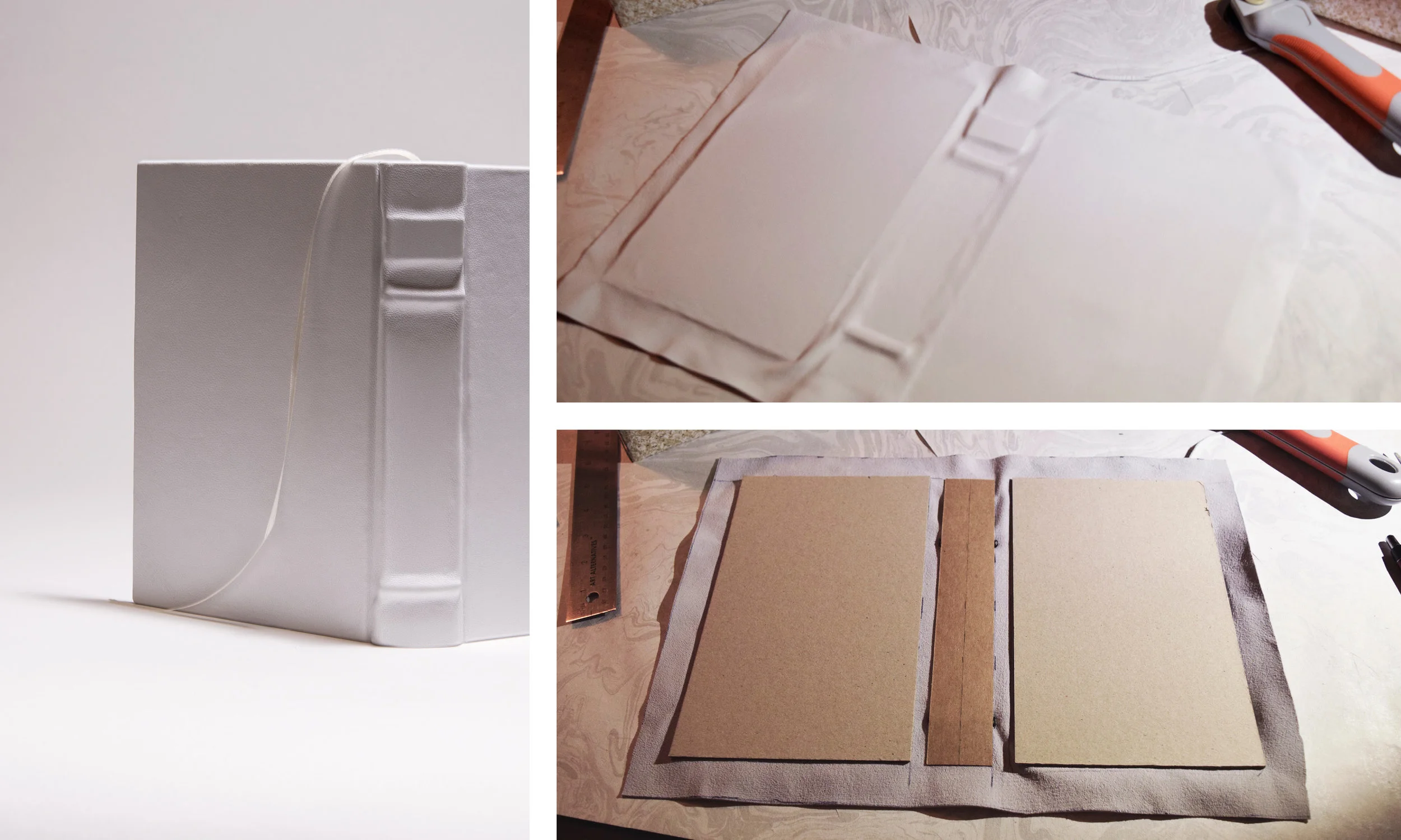
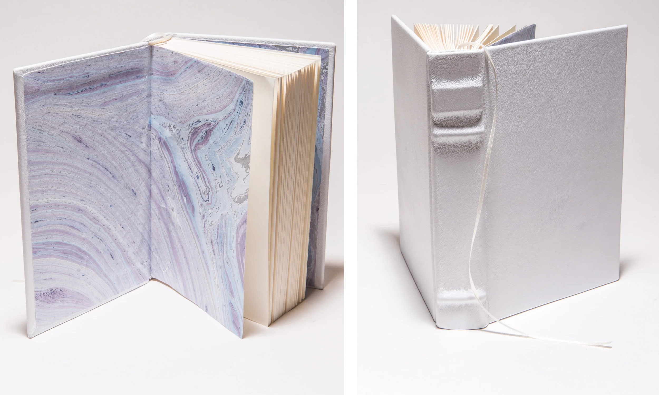
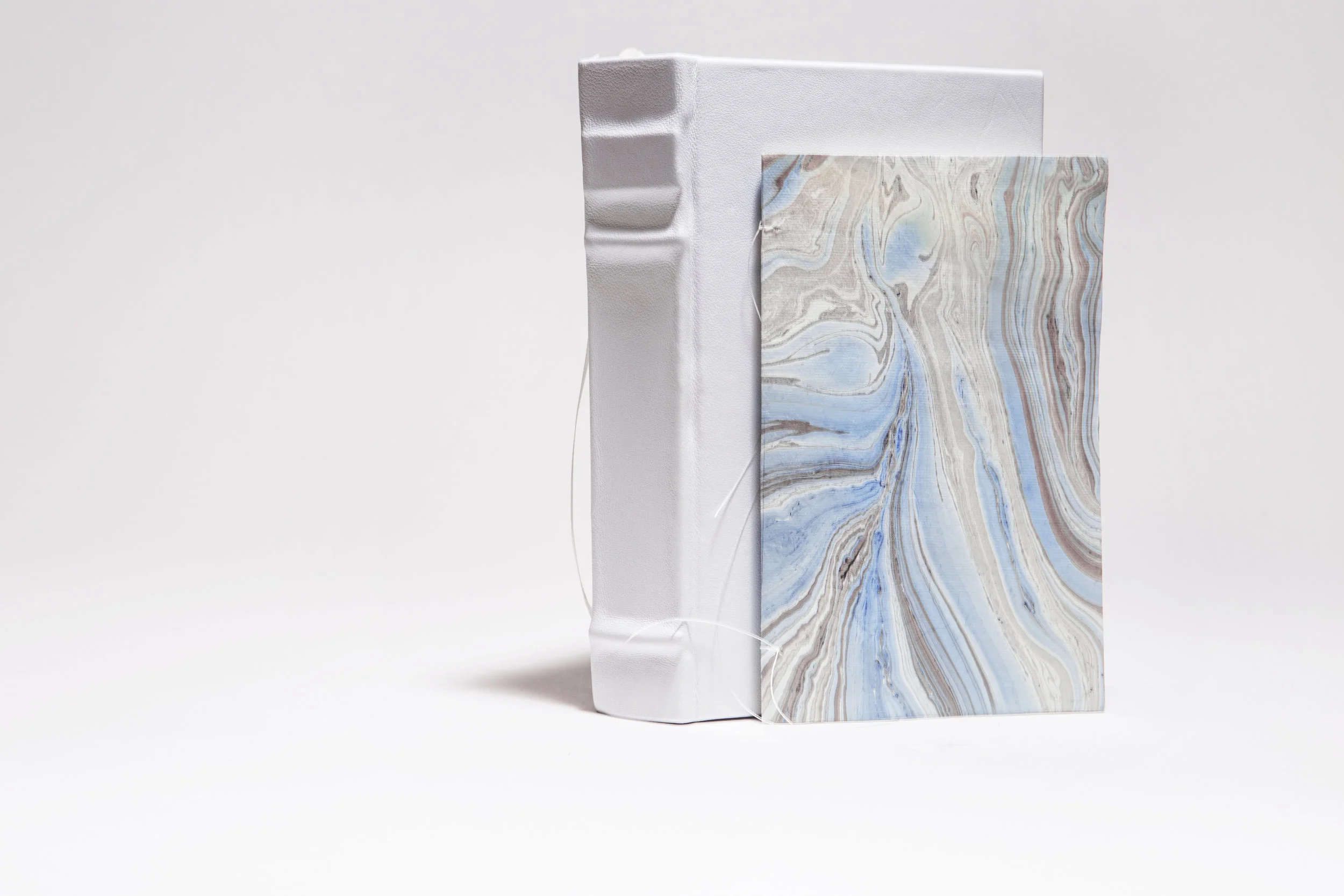
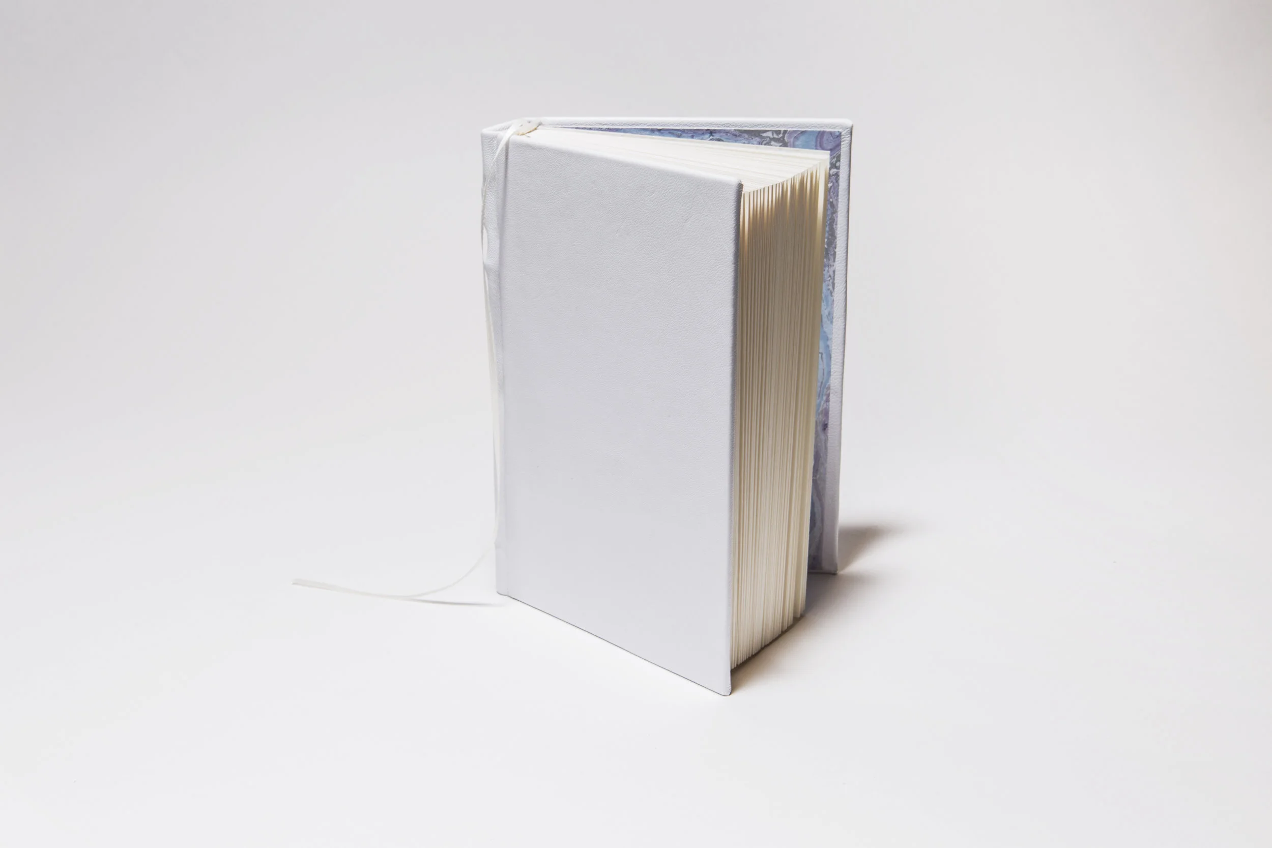
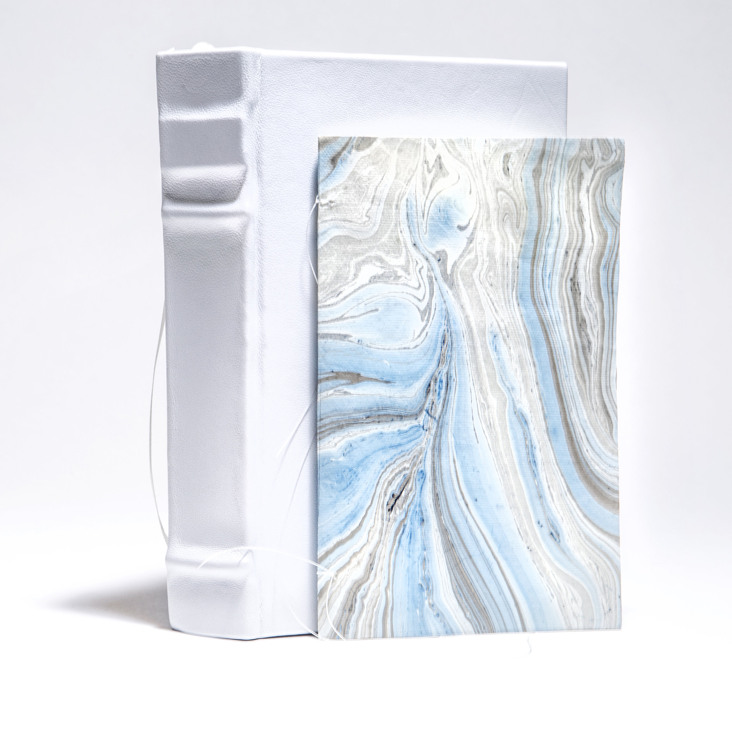
Composed of hand-stitched signatures, formatted type, leather bound casing, and original illustrations, this project was brought into fruition as a limited edition version of The Unbearable Lightness of Being by Milan Kundera. Possibly one of the most complex and rewarding projects I’ve ever worked on, the ultimate goal for this handmade book was to bring to life the beautiful love story and wisdom of Kundera’s words.
Because this novel deals with the idea of separation verses synthesis of soul and body, I included a series of nude drawings to signify characters in their various mental and emotional states. The images were drawn with pen and ink, and then scanned digitally and embellished with a watercolor mark. None of the characters are drawn in their full bodies to signify the inability of each to deal with the lightness or heaviness of their lives. The story is told with seven different parts, and one illustration is featured at the beginning of each of these parts. I chose a marbled paper for the end sheets that visually represented the floating nature, which the characters in the novel struggle with. Printed using the Konica Minolta, the signatures were folded and stitched by hand before being bound in white leather casing with a raised spine. I chose not to differentiate the front from back as a way to mirror the ambiguity of the lofty concepts and hazy meanings this book presents.
My blood, sweat, and tears went into making this book a reality. Every aspect of this handmade edition was carefully thought out, planned, and executed, and the final product reflects the extensive care put into it.
For educational purposes only.
S K I L L S
Leather Binding
Saddle Stitching
Bone Folding
Polar Cutting
Konica Minolta Printing
Illustration
Typography
Page Layout
Adobe InDesign
P A I N T I N G S
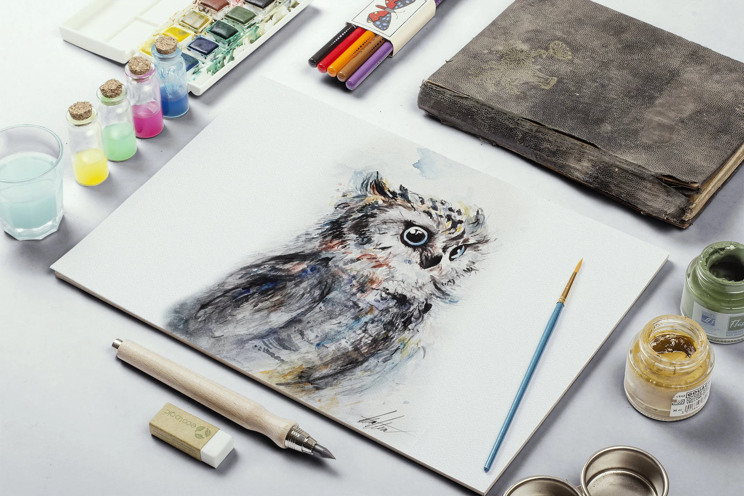
What started out as gifts for friends and family, quickly developed into a skill and a passion for watercolor painting. Although the paintings were made for recreational purposes, having the ability to manipulate watercolors has proven to be a great asset in graphic design. Other projects on my website were made possible with the watercolor skills I developed from these paintings.
S K I L L S
Watercolor